Care Solutions
Lead UI/UX Designer for Early Childcare Education Application System
TOOLS
UI/UX: Figma, Sketch, InVIsion
Graphic Design: Figma, Adobe Illustrator, Adobe InDesign, Adobe Photoshop
User Research: focus groups, Google forms, Google Excel, Airtable
UI/UX: Figma, Sketch, InVIsion
Graphic Design: Figma, Adobe Illustrator, Adobe InDesign, Adobe Photoshop
User Research: focus groups, Google forms, Google Excel, Airtable
Context
Care Solutions consisted of two branches: ProSolutions, an online site for early childhood training courses/CDA classes, and a consulting firm for early childcare programs for Georgia teachers. I served as the solo UI/UX designer for ProSolutions, and the lead designer for the consulting side. The company has worked with various contract designers previously, so my first priority was to introduce consistency throughout the pages, i.e. fonts, buttons, components, etc., and to implement a design system for the future. My first projects were to review all ongoing design work and then collaborate with developers to quickly adjust functionality for clients.
Challenges
- Being the bridge between developers, project owners, clients, and various types of admin staff: company's first time aligning every role's work responsibilities into one process flow
- Serving as the first in-house UI/UX designer: standardizing files & components while continuing to address tickets
What I learned
- Communication between groups of approval levels & staggering ticket workflows to maximize overall efficiency
- Optimizing design systems to meet changing developer needs
- Understanding metadata and automation parameters to improve user experience & backend informational architecture
Overall Goals for Each User Group
The company has multiple levels of data access in the application approval process. A majority of applications could only be completed using the corresponding workbook and submitted through mail/fax. Afterwards, any changes must be made by phone and in some cases, require additional documents. This process caused applicants to re-enter information for every program each year. It also required admin staff to manually enter applications each time into our system.
On the admin side, information was inputted into various charts; some without even proper headers. We had a printed navigation key to understand the excel sheets. Programs were being launched faster than developers can create admin portals for. We needed modular page templates to quickly match any upcoming program's formats and parameters.
Access level map for the application approval process



Introducing Consistency
Branding &
Design System
Design System
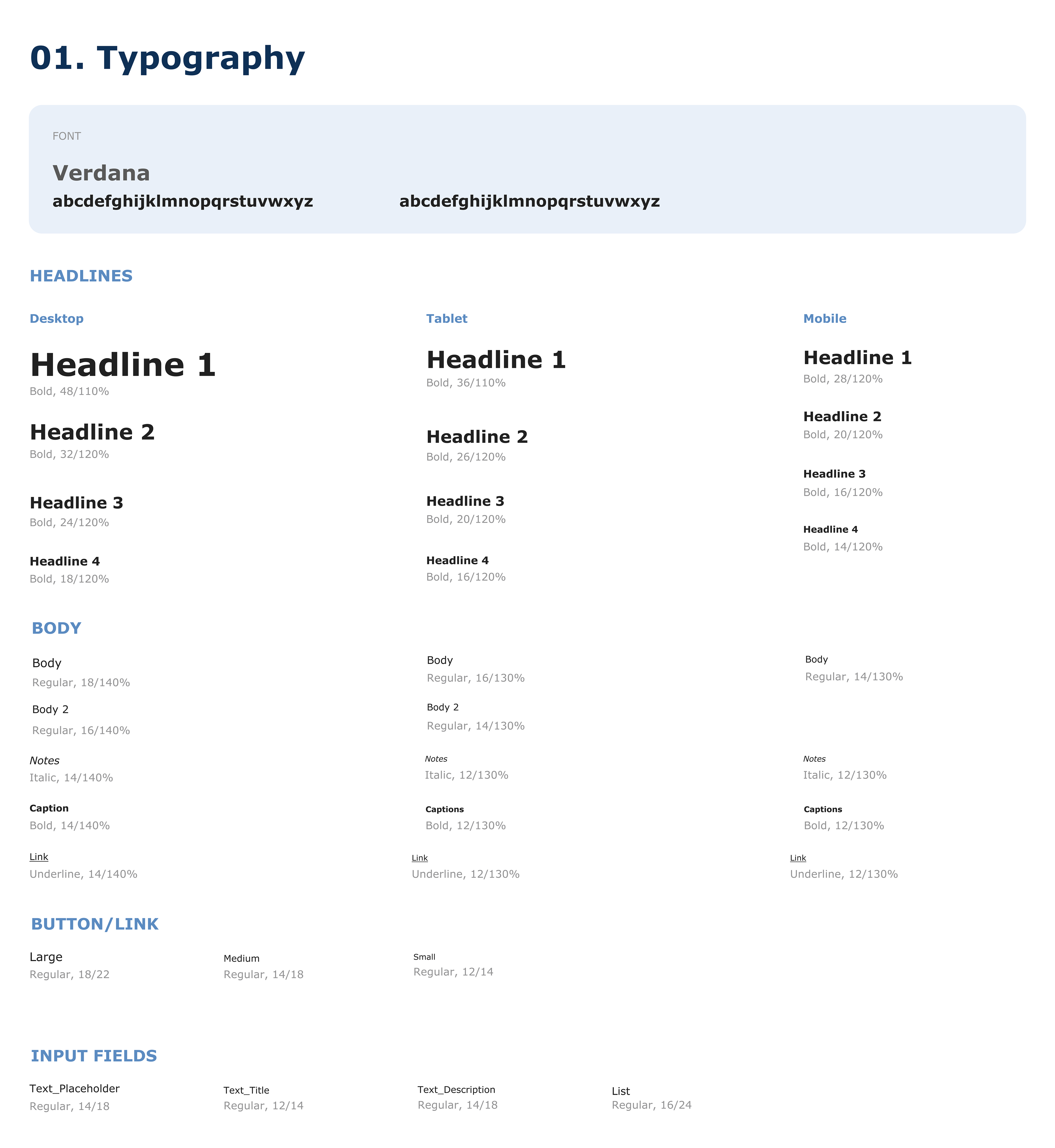
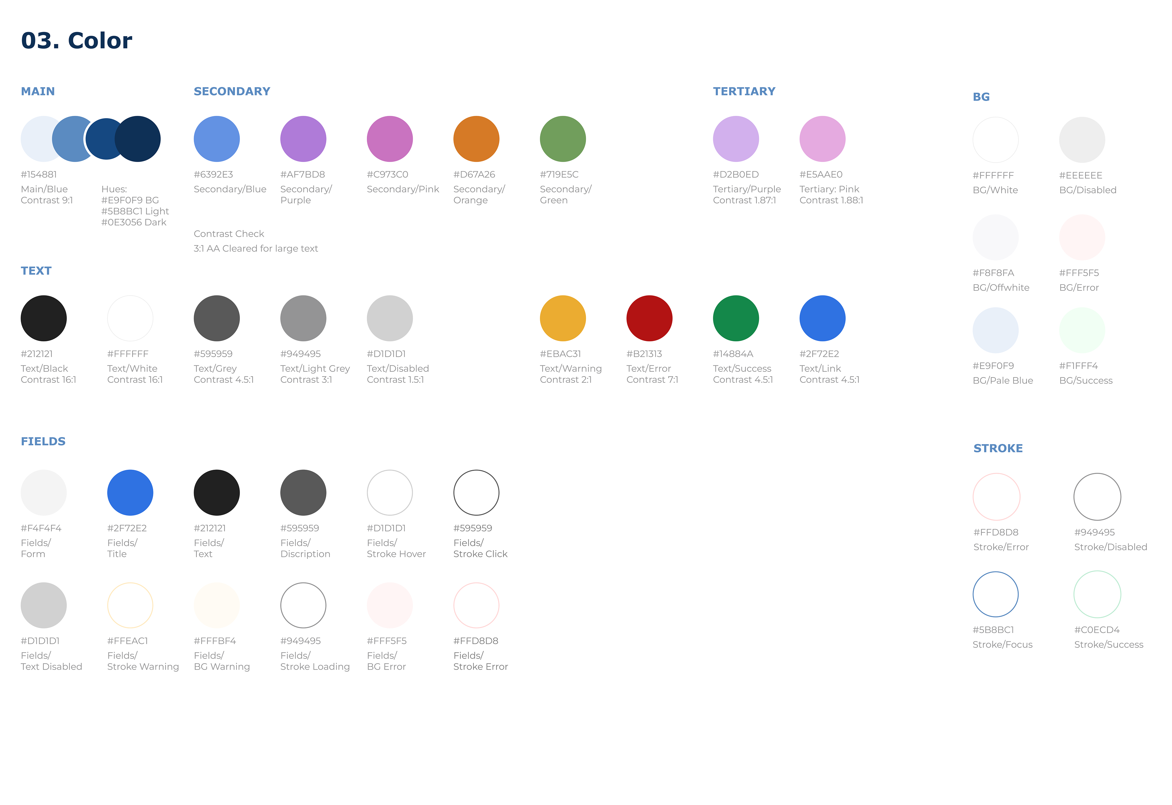
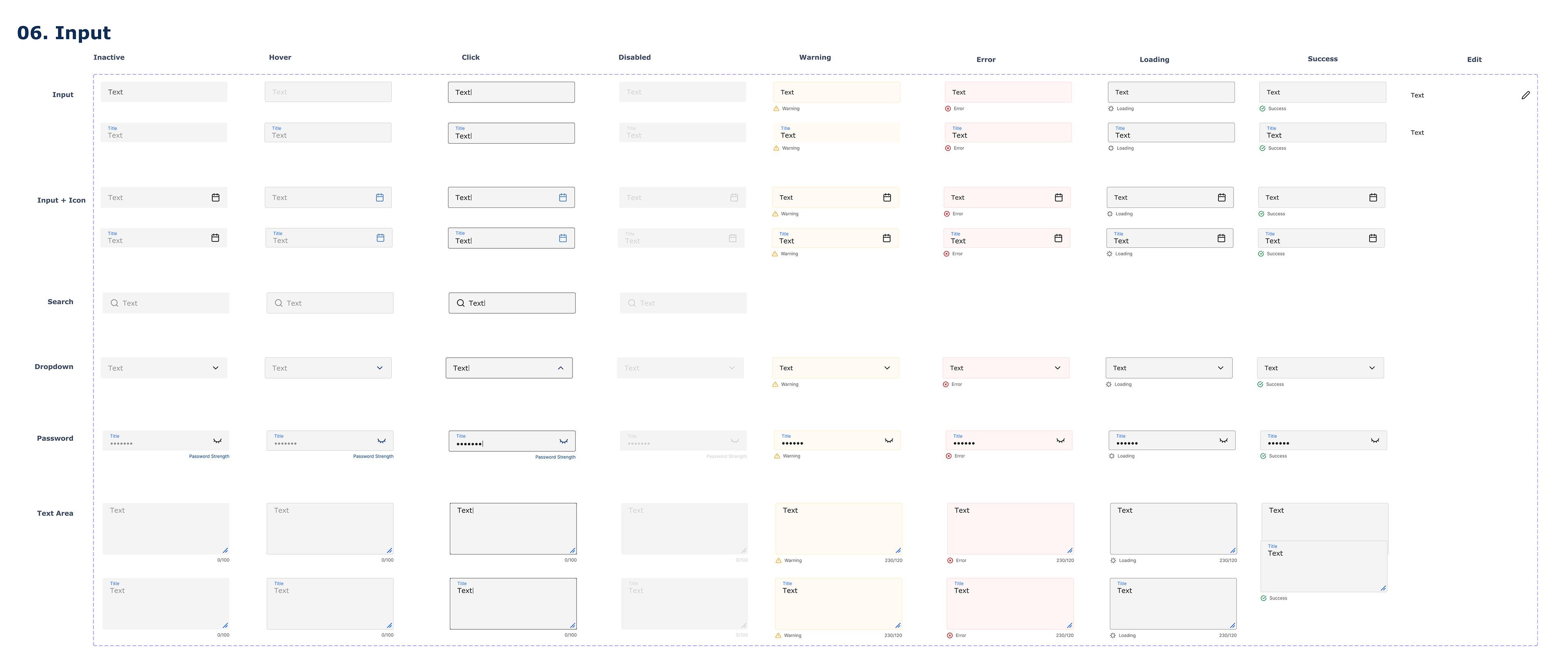
I worked with stakeholders and the marketing team to understand the overall aesthetic for the company. The priority was to choose an accessible font and color scheme for strong visual consistency among all projects. As we were creating the first company design system, I set up a placeholder before adjusting a MUI file to meet our needs and streamline developer output.
Site Mapping
I worked with admin staff to narrow down the key functionalities and databases necessary in their work. Due to the fact that pages were added as needed throughout the years, I had to visually present all existing pages as some were referred to differently among the teams, and there were duplicate or unlinked pages in some cases.
Before: Original Site Map
After: Simplified Site Map
Building the Site Back From 0-1
The internal site had been pieced together over the years with new pages and new functionalities to meet the changing application requirements. With a multitude of designers and developers contributing, the site was difficult to navigate without an in-depth knowledge of the workings. This made it challenging to onboard new admin staff or to even allow another staff member to take over work when needed. Some webpages even required staff to reference printed PDFs to understand tables and content blocks.
Page that most admin could not operate & voted to remove in the redesign
Business Goal: Improve the Following Metrics
Availability & Access =
Increase # of Applicants & Retention
Increase # of Applicants & Retention
Mobile accounts for approximately half of web traffic worldwide. In the last quarter of 2024, mobile devices (excluding tablets) generated 62.54 percent of global website traffic. - Statista
A study found that 23% of users triggered autofill functionality when completing forms. Among these users, the overall completion rate of the forms was 71%. In comparison, for users who did not utilize autofill, the completion rate was 59%. -Zuko
Reliability of Data Collection =
Reduce Processing Time & Operating Costs
Reduce Processing Time & Operating Costs
Online methods can achieve error rates as low as 0.6% while paper-based methods can reach up to 2% or higher, primarily due to the reduced need for manual data entry with online systems. -BMJ
In average, the use of digital forms represents saving 11 work hours per week, and saves company owners six hours per week. - DataScope
Improvements for Applicants
In the original user journey, applicants had to purchase a workbook and/or download a PDF booklet for each individual program they wished to apply to. Then, these applications had to be mailed or faxed to our processing office. Any information changes had to be dealt with through a call to customer service. If additional documents are required, applicants may have to repeat the process. We had a few people come directly into the office because of the long periods of uncertainty and the tedious calls to check on their statuses.
GOING DIGITAL
From workbooks & faxing -> online applications & instant updates
From workbooks & faxing -> online applications & instant updates
Redesigning the User Portal
Dashboard
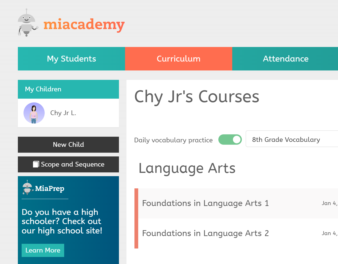
The original applicant portal landing page was a bright and chaotic space. We had to clarify the navigation and core functions of a dashboard i.e. highlight the most recent application statuses and prompt to necessary actions to take. The page was redesigned to have program summary tiles that easily translated to mobile view.
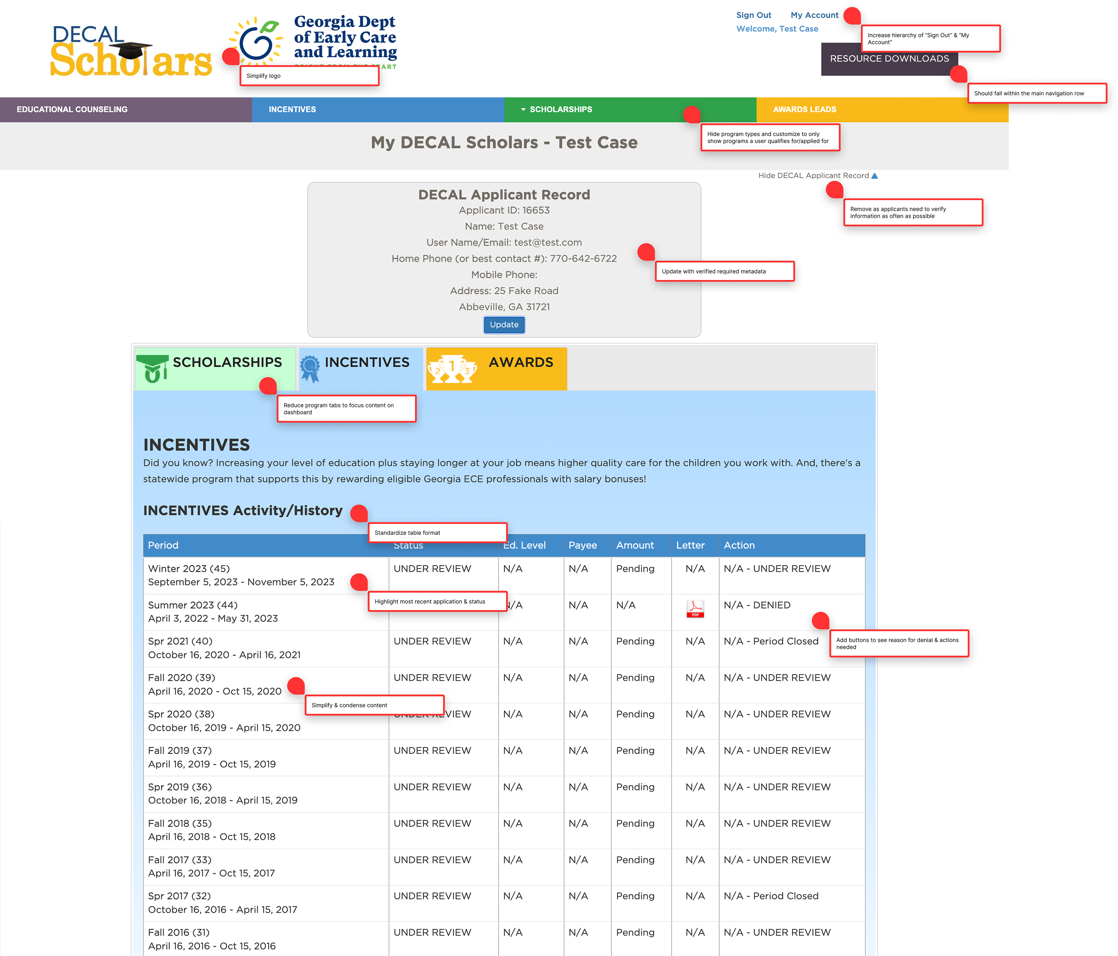
UX review done with admin manager
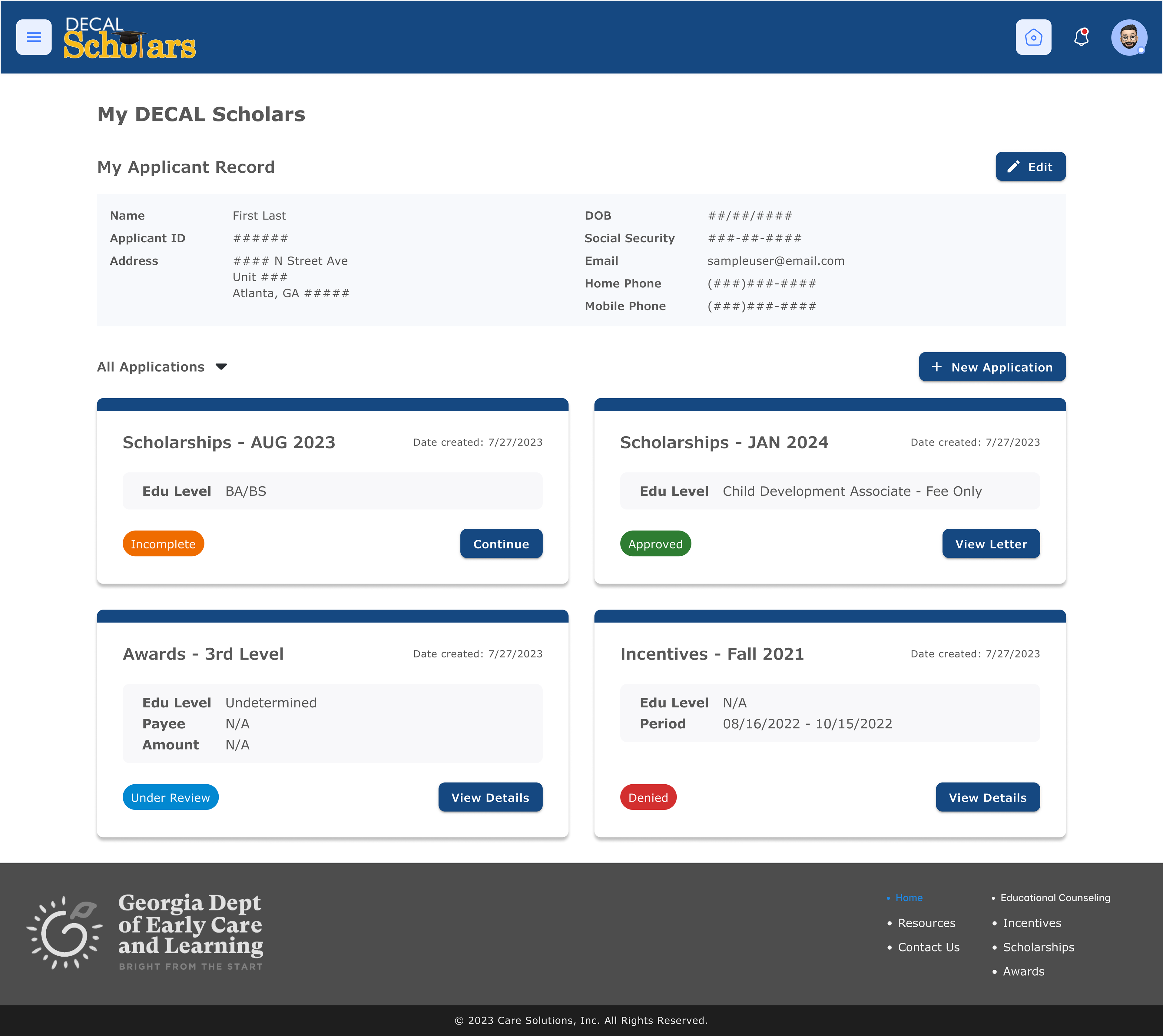
Dashboard redesign
Application Status Tracking
It was important to separate out the program history tables as more programs will be introduced. It reduces the load time per page and hides programs that an applicant might not qualify for. I standardized the table formats and highlighted the statuses to increase the visual hierarchy. We also implemented action buttons to guide applicants to update their information as needed.
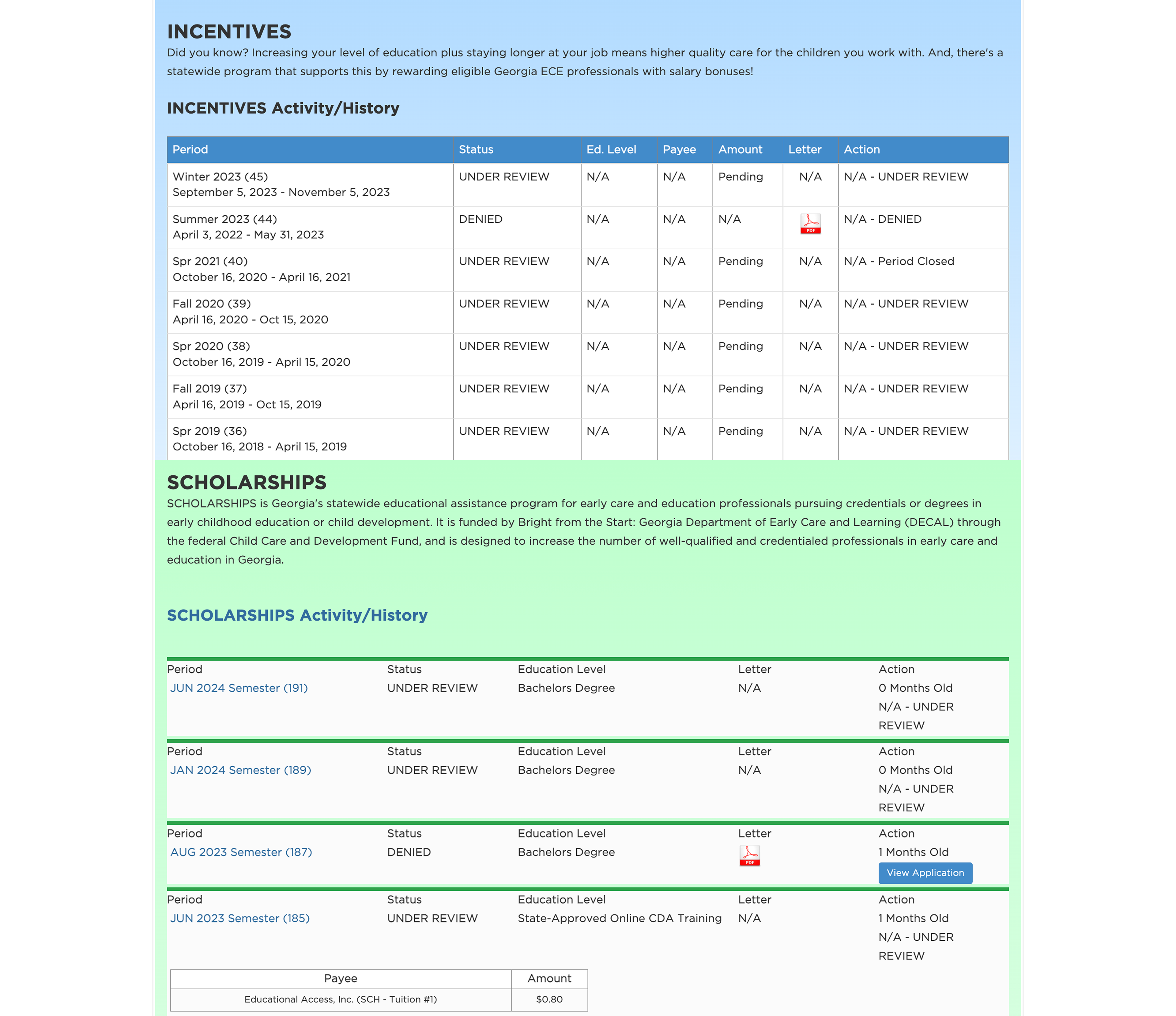
Original activity/history tables
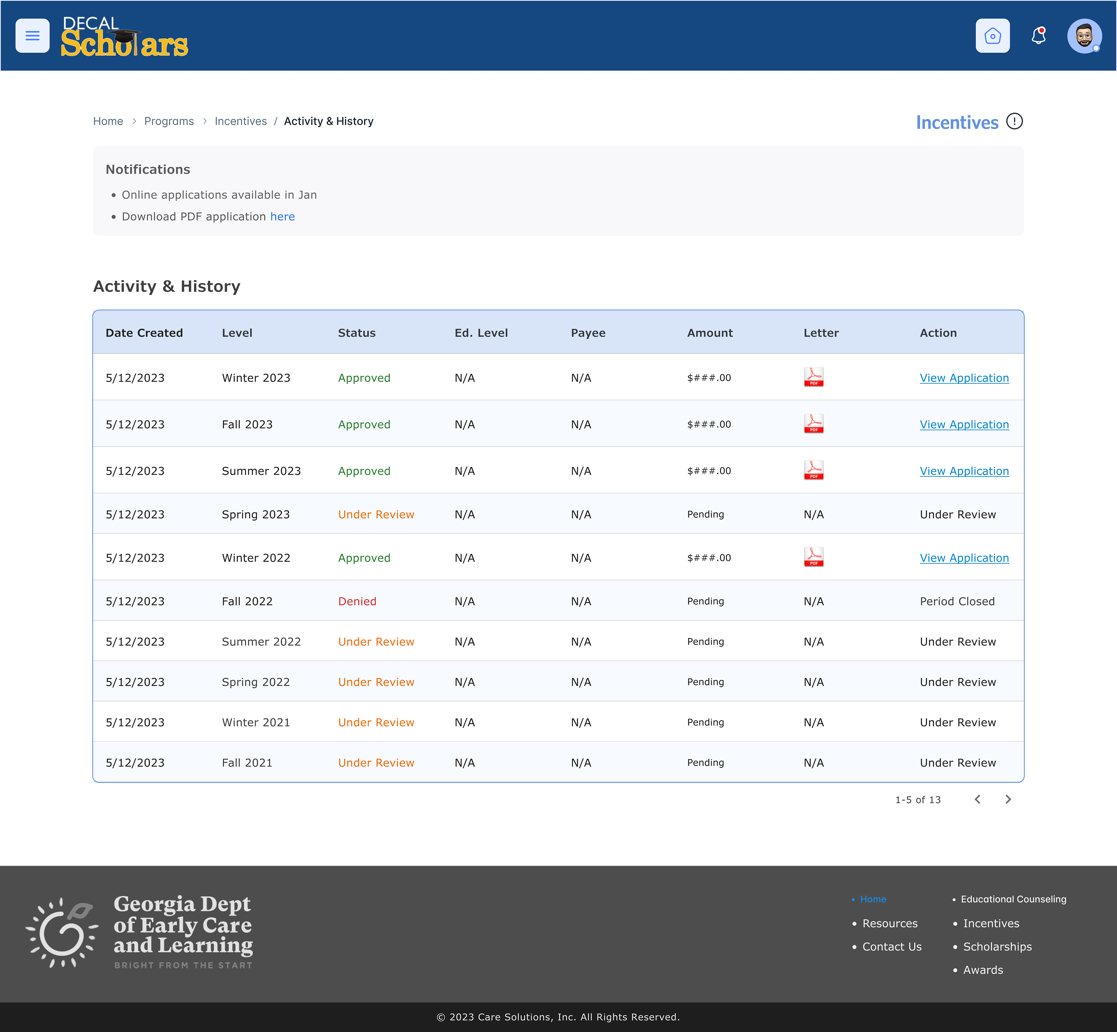
Standardized table format
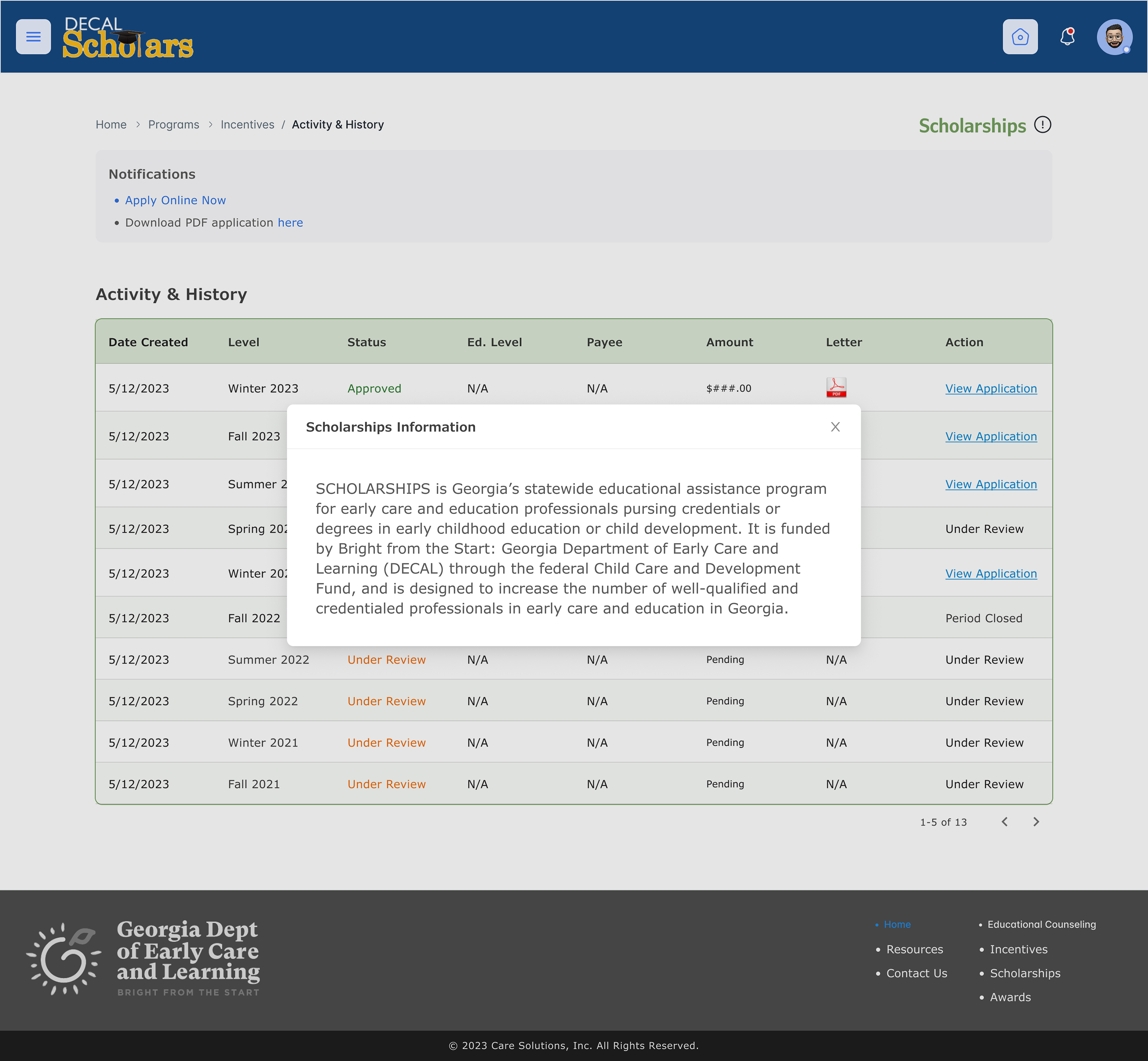
Informational popups
Converting to Online Applications
Pre-Qualification
Surveys
Surveys
User tend to report higher satisfaction rate when filing out forms with inline validation. It helps applicants to know as quickly as possible if they qualify for a specific program. In the backend, these pre-qualification surveys direct users to the correct application form when one program can have up to 8 variations based on employment, education, citizenship, etc.
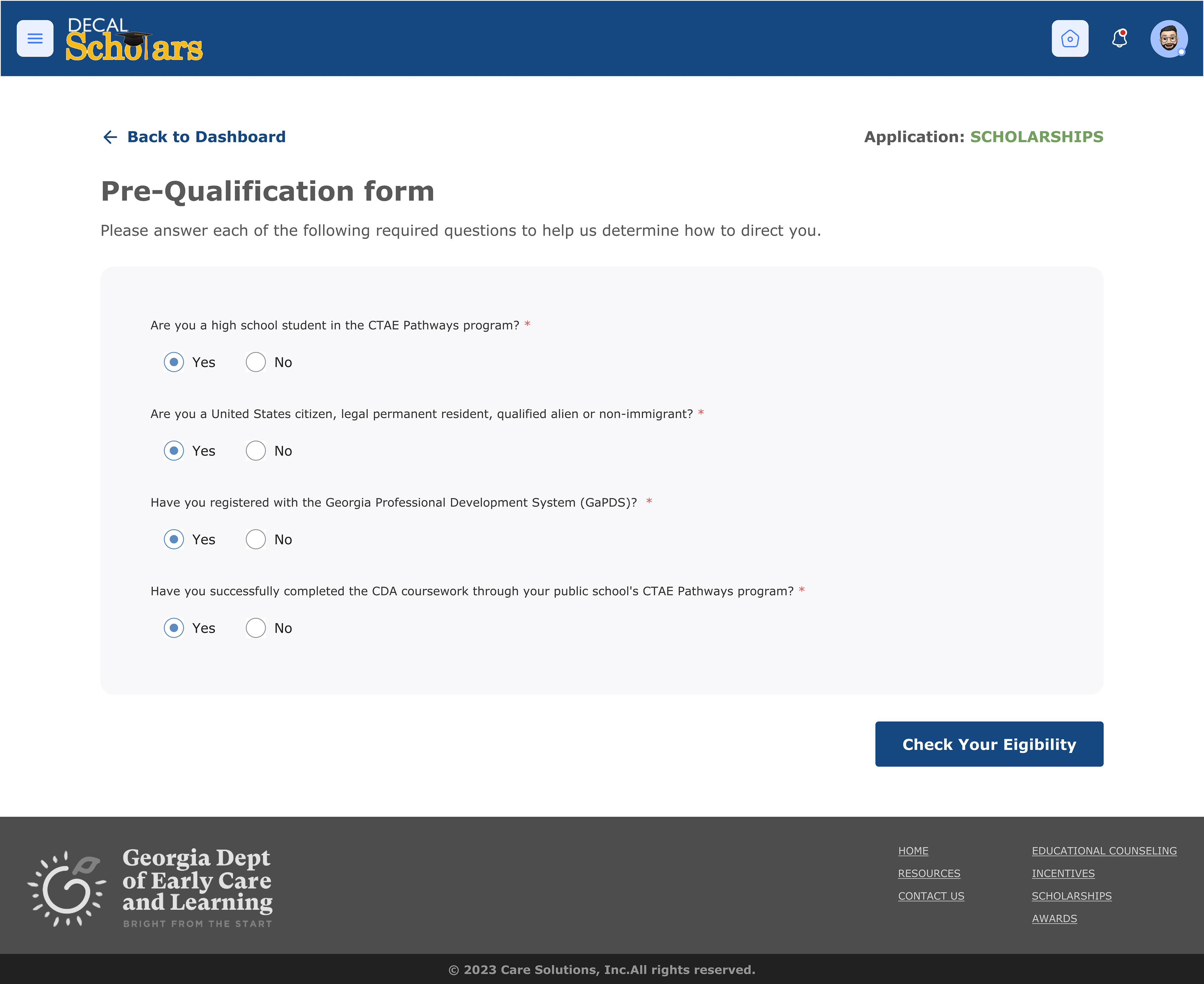
Survey
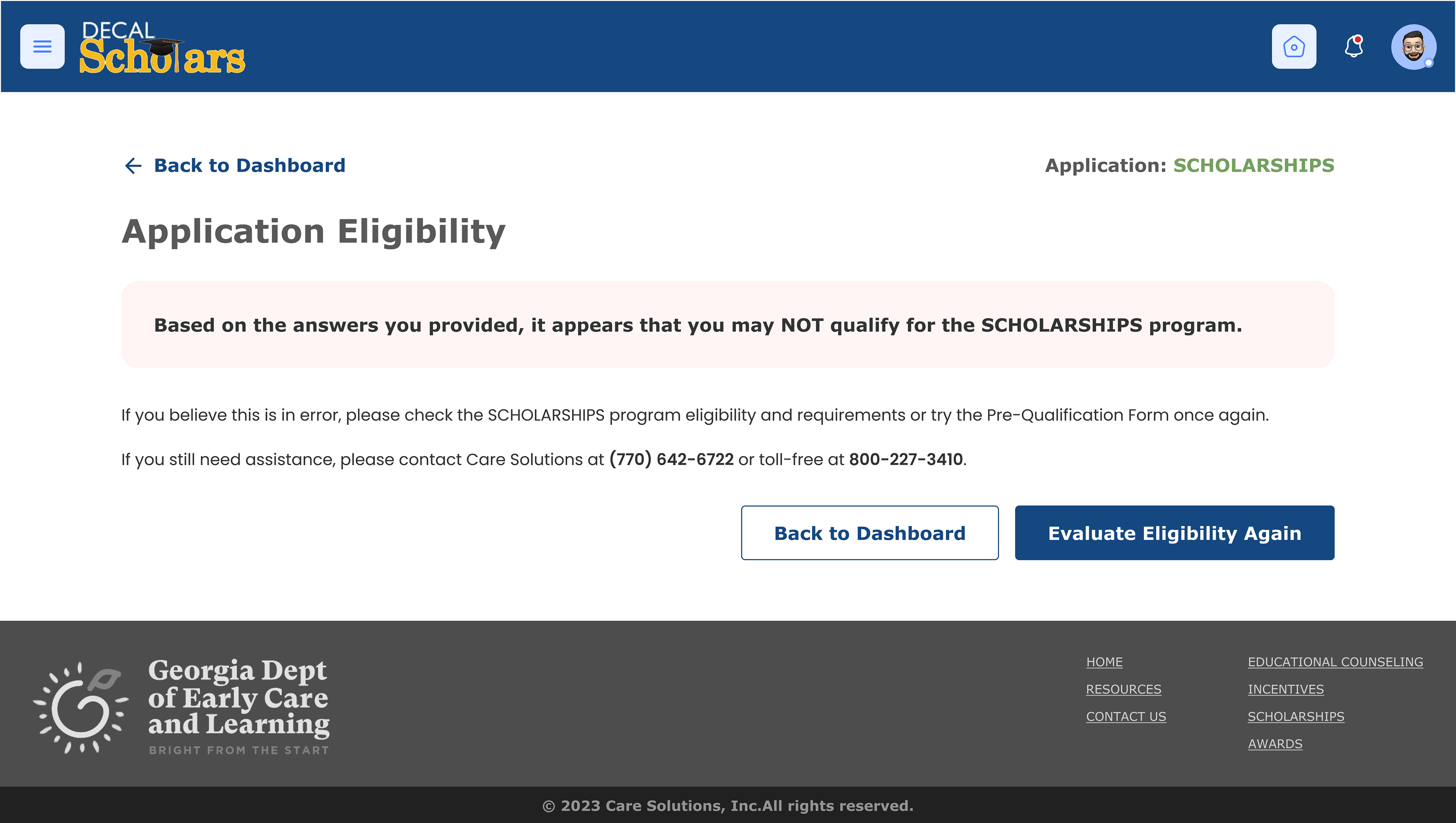
Disqualified results
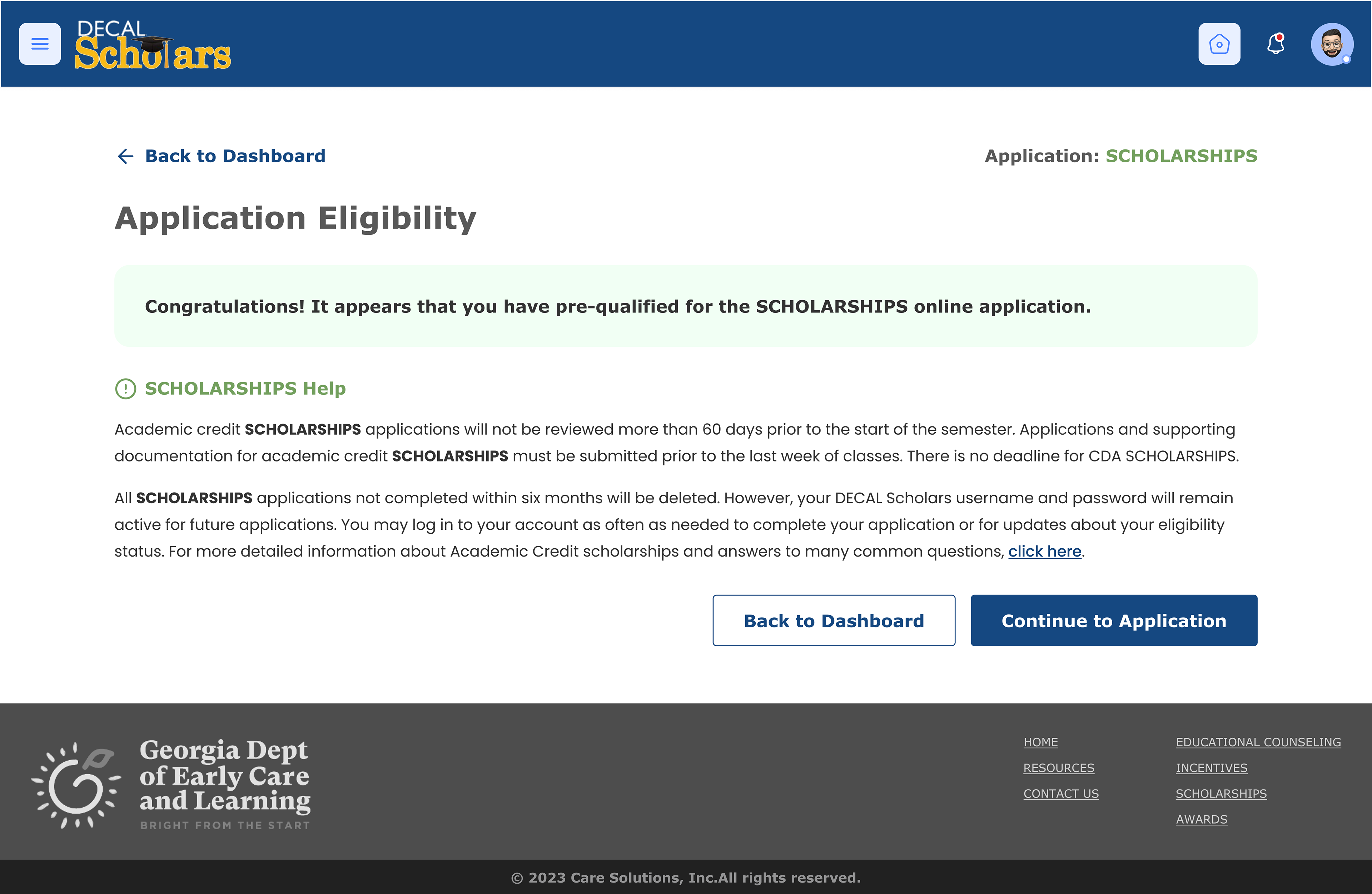
Qualified & linked to relevant application
Benefits of
Digital Forms
Digital Forms
The first step in converting to online applications was to create a system of modular pages and content blocks. I worked with admin staff to simplify the necessary metadata needed for a successful application by compiling all variations of question types into survey components. We also automated secondary questions triggered by specific answers. This standardized the application process for all programs and allowed for the introduction of autofill, further reducing the time commitment needed.
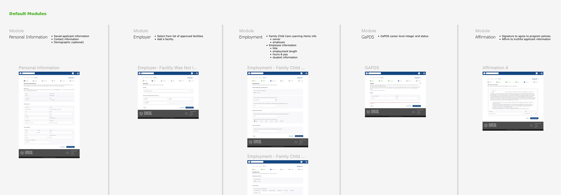
Modules document for project managers to use as building blocks for new program tickets
Introducing Mobile Friendly Components
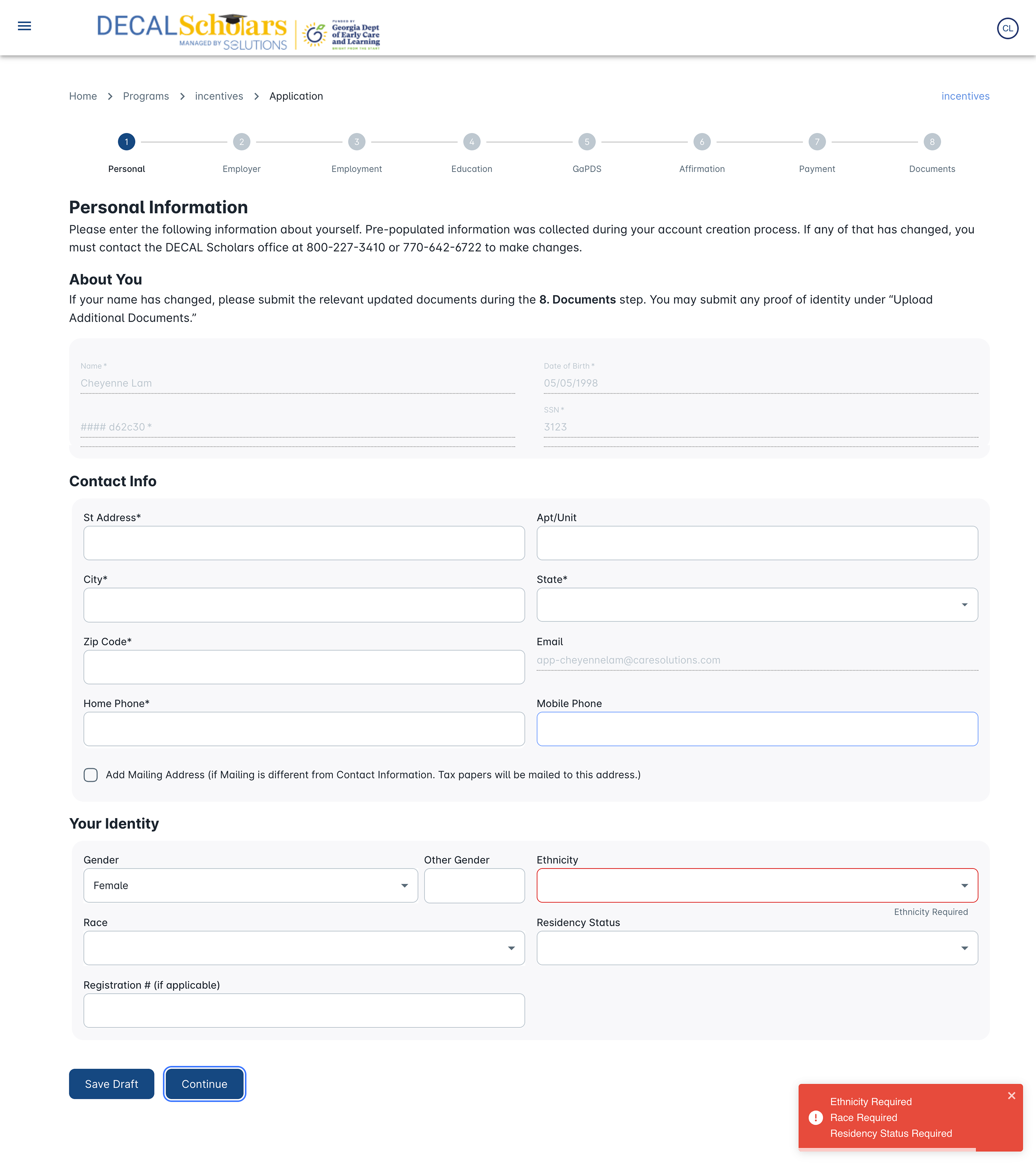
When I first started at the compony, websites were converted to mobile use by purely shrinking the page content sizing. This meant users had to horizontally scroll to view the whole page. I collaborated with developers to create a standard of using mobile and desktop components. One practice that I put in place was limiting content columns to two to reduce visual clutter, and simplify the conversion to mobile.

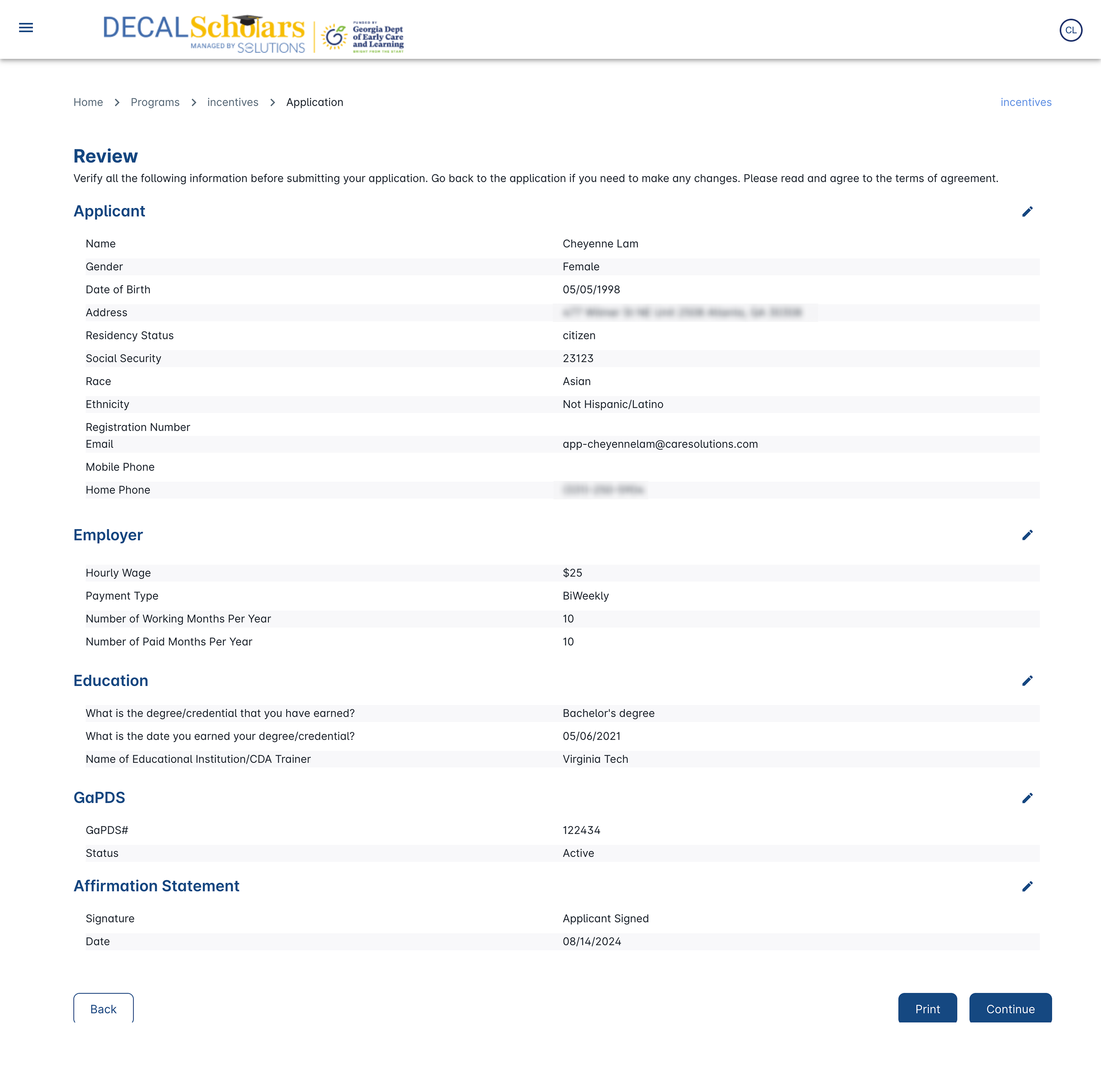
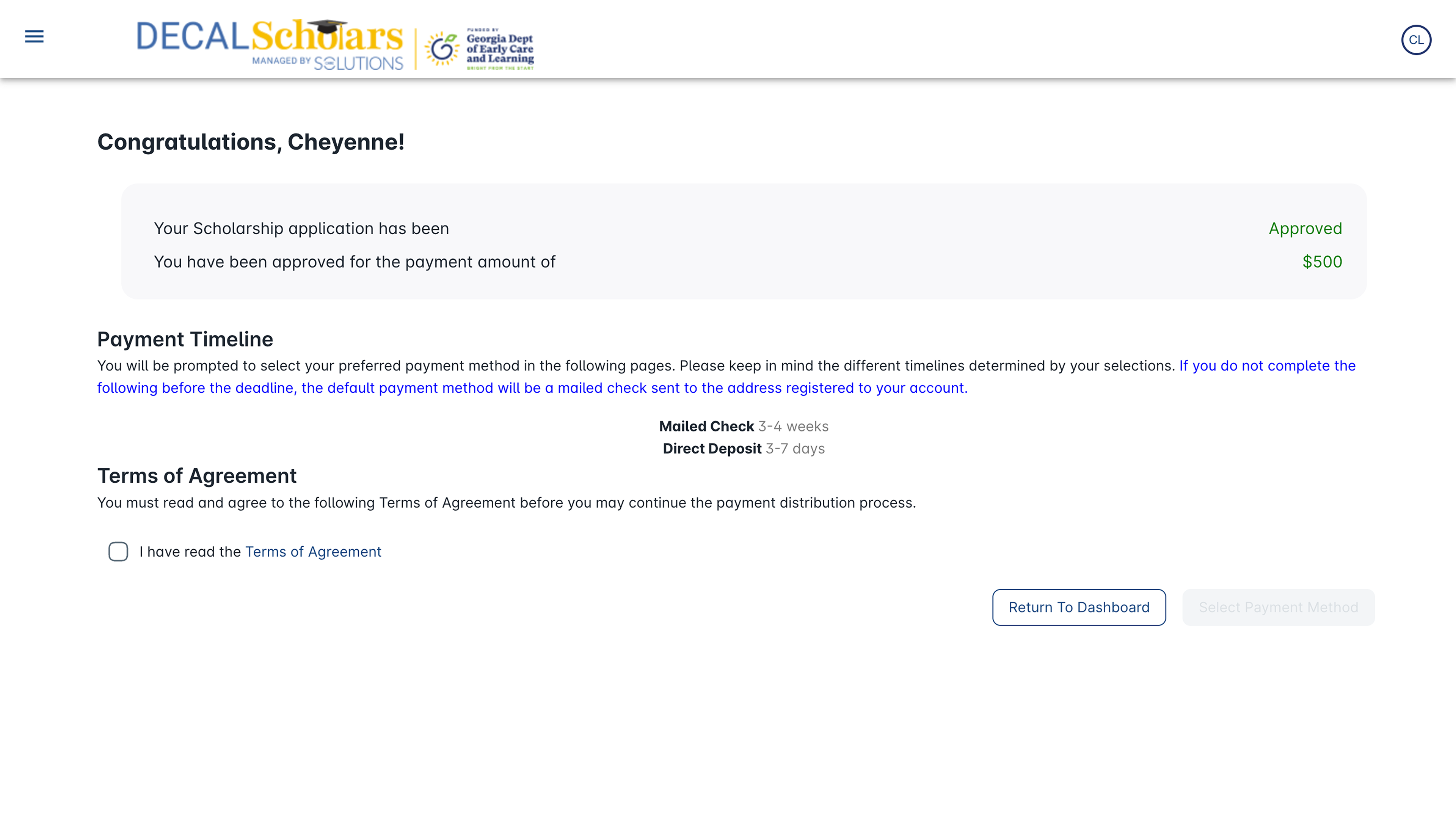
Desktop & mobile screens for application pages required for this program. Each page had its own detailed individual design file & Jira ticket
Live Site as of August 2024
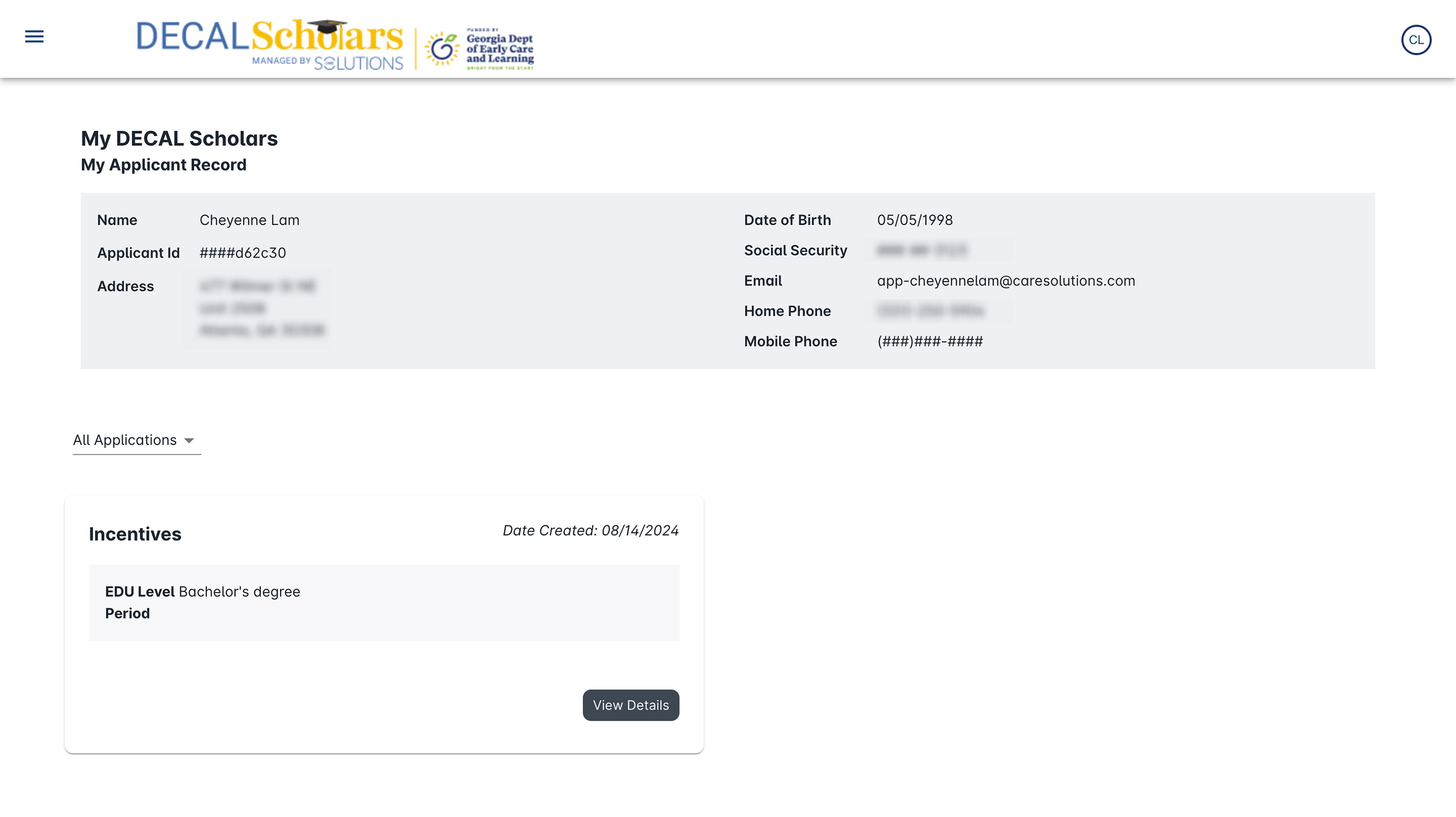

Improvements for Admin Staff
Admin were short staffed, and processing times were long because applications had to be manually entered into our system. All identifying documents i.e. licenses, passports, etc. had to be digitized as well. This caused tedious workflows where information had to be entered into multiple tables and systems to be verified. In some cases, the processing had to be outputted back into printed media to be mailed to the next step. The priority was to have all access levels contribute to the flow through one system, and automate as much of the data collection/verification as possible.
COLLABORATION & CENTRALIZATION
One place for all databases, call logs, processing, invoicing, program details, etc
One place for all databases, call logs, processing, invoicing, program details, etc
The New Admin Portal
Dashboard
When admin log into their portal, staff and managers view the same screen: applicant search and all unprocessed documents. We had to separate the access levels and introduced a feature to show assigned work per staff member. This sped up the processing flow since staff can now focus on only their assigned applicants. We also introduced application categories and alerts to assist in the desired journey. Applicant search was still available, but much lower on the informational hierarchy as its use case is rare.
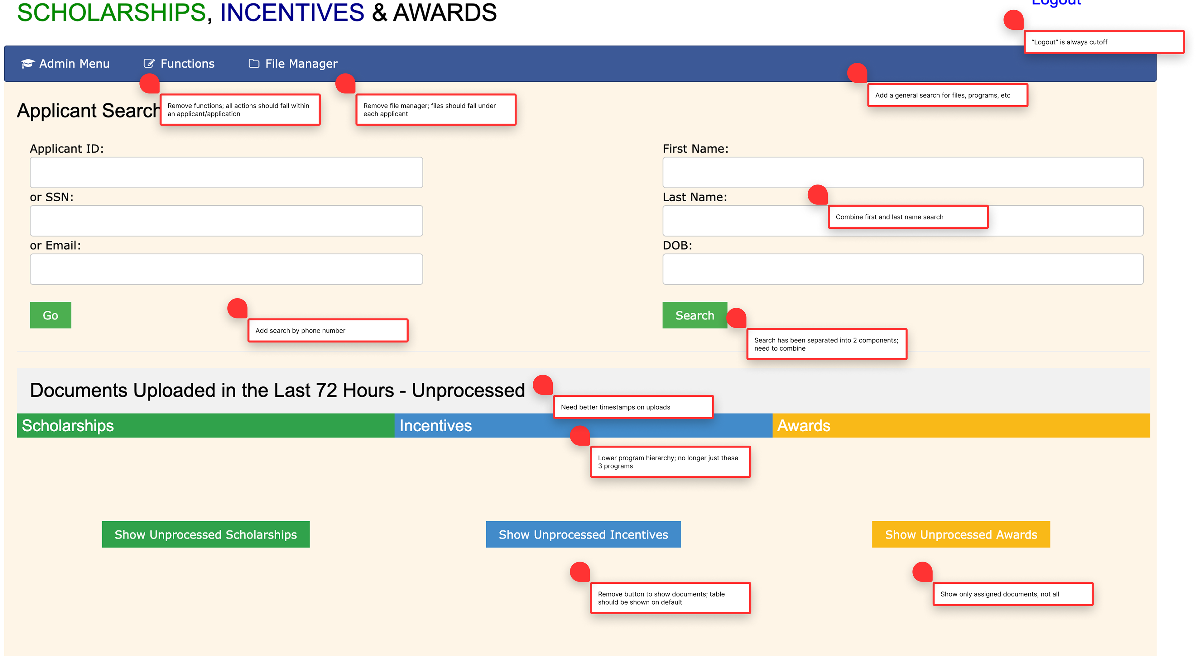
UX review done with admin manager
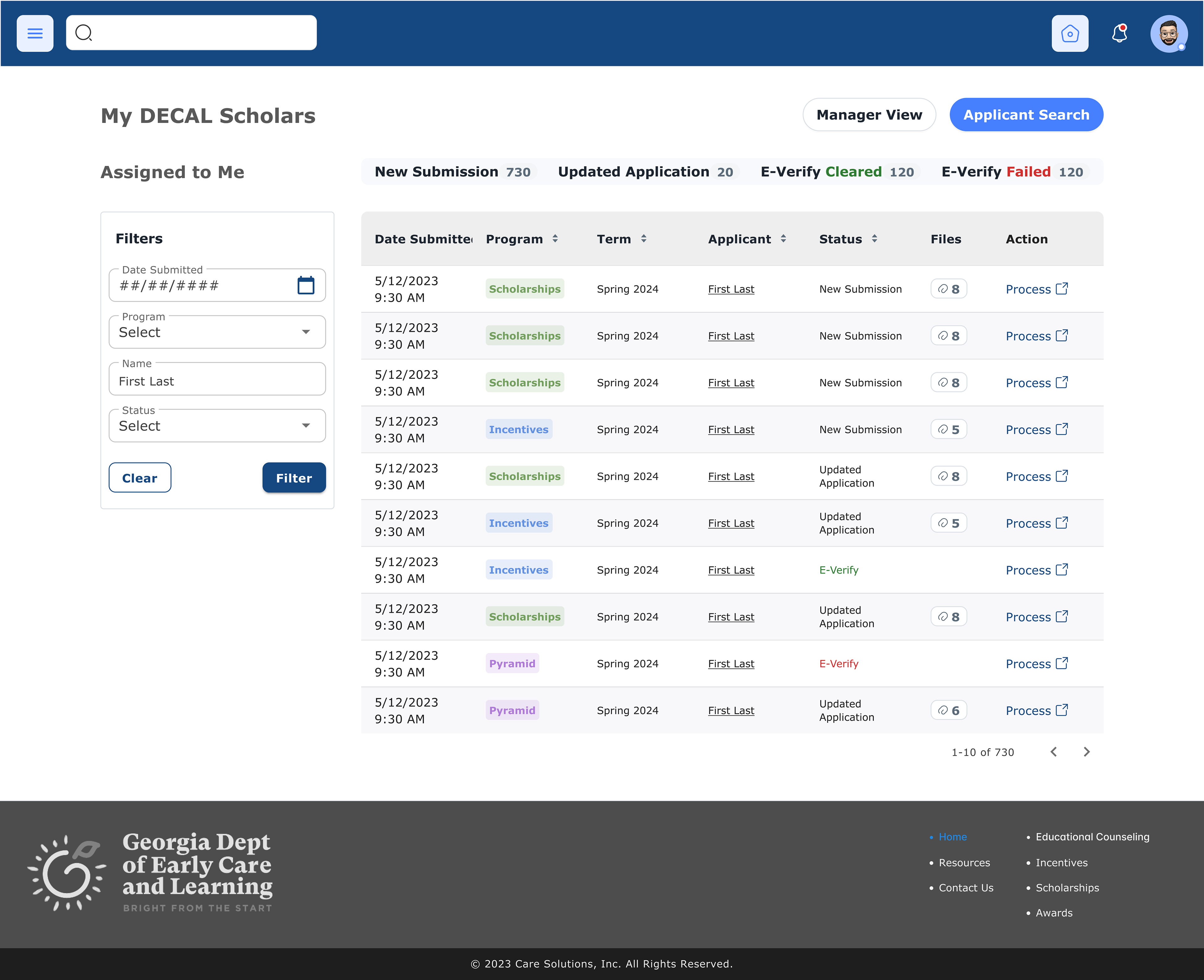
Dashboard redesign
Applicant Data
With feedback from the admin manager, I differentiated applicant level information that can be applied to all applications and application level data that was specific for each program and each programs's active period(s). This made it easier to view data like basic information, citizenship status, overall application history, and program qualifications. I also worked with admin staff to understand their day-to-day and to best design for their work flow.
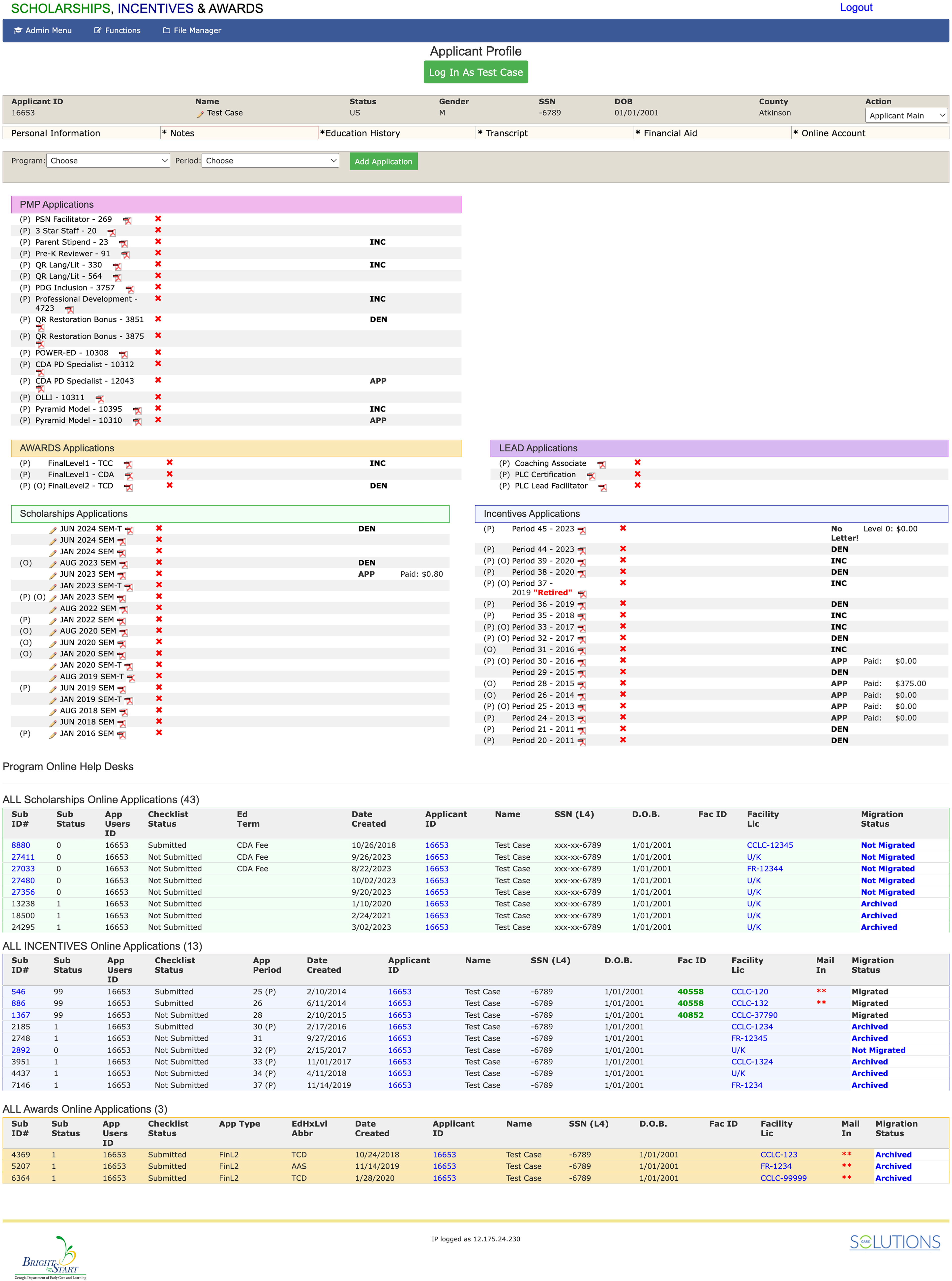
Original applicant info page

Sample of how we sorted cards into information hierarchy
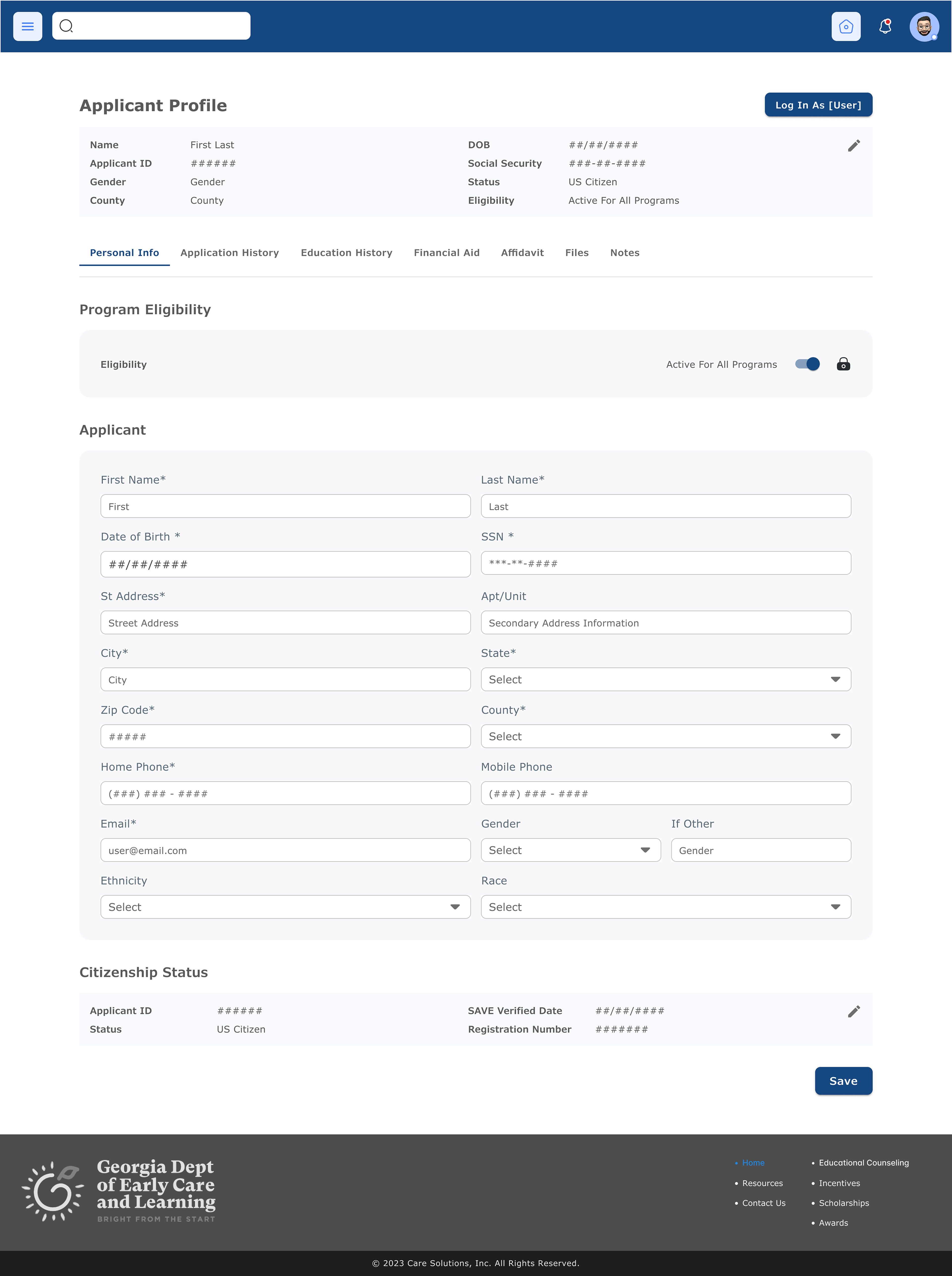
Updated applicant info page to assist in daily admin work flow
Processing Flow
By digitizing and centralizing all the processing steps, it became possible to automate qualifications parameters. Once employment, education and citizenship was verified even once for an applicant, it updated the system of all programs he or she can apply for. We also automated reminders for missing data or documents on both ends. Admin enjoyed the new notes tracking functionality to track calls, inquires, etc. All these updates simplified the work flow for staff and sped up processing times.

Application processing pages required for admin staff to track information & move to further steps as needed
Untangling the Levels of Admin
One of the business objectives was to create separate portals for all access levels. The original portal was the same for all staff, managers and finance which was a security risk. We also did not have a portal for trainers, facilities or government, so these parties all relied on emails, mail and calls to manage their information and learn about program updates. We wanted each user type to have a focused journey through their individual portals, and reduce the need for secondary communication tools as much as possible.
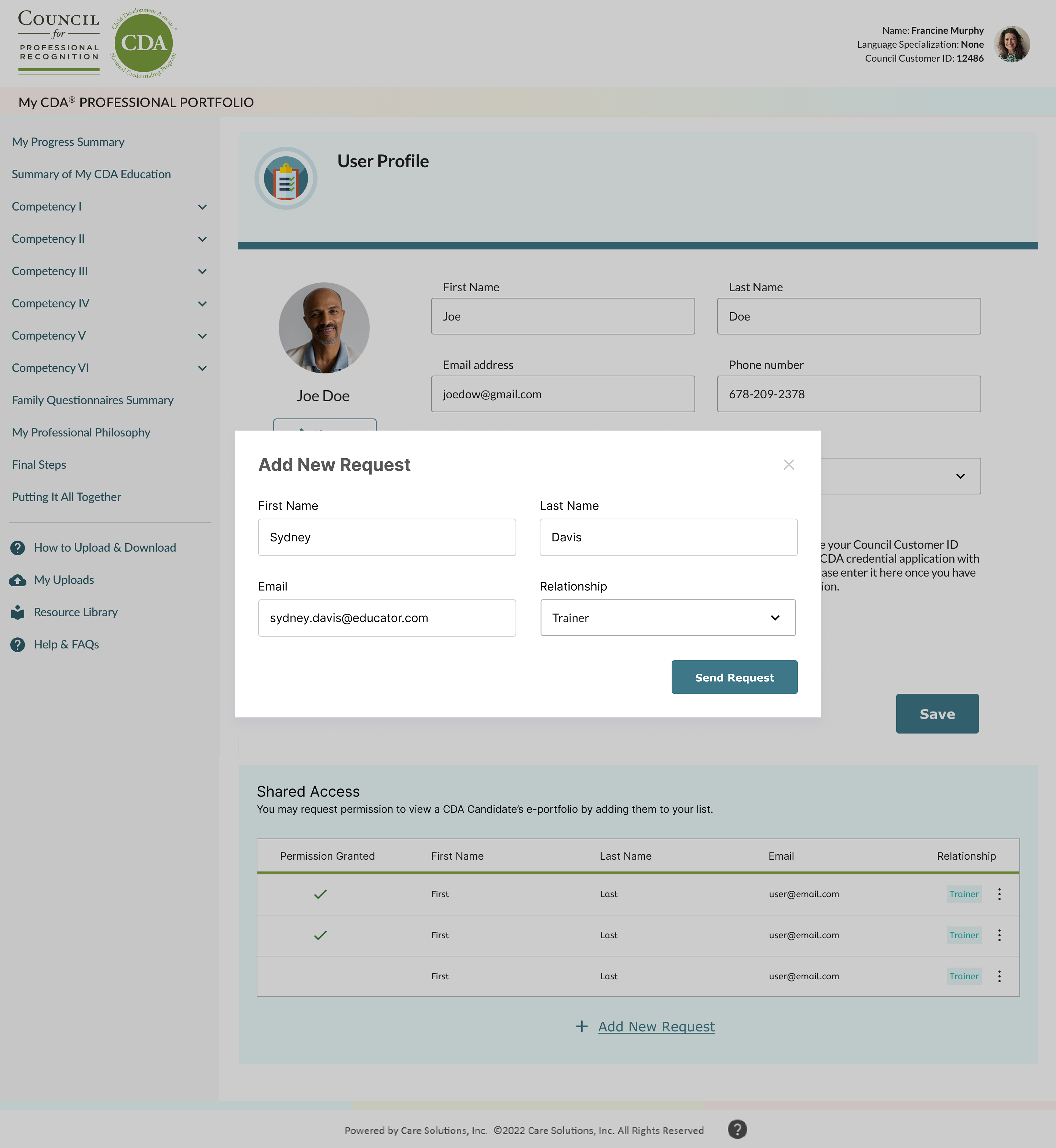
Trainer Portal
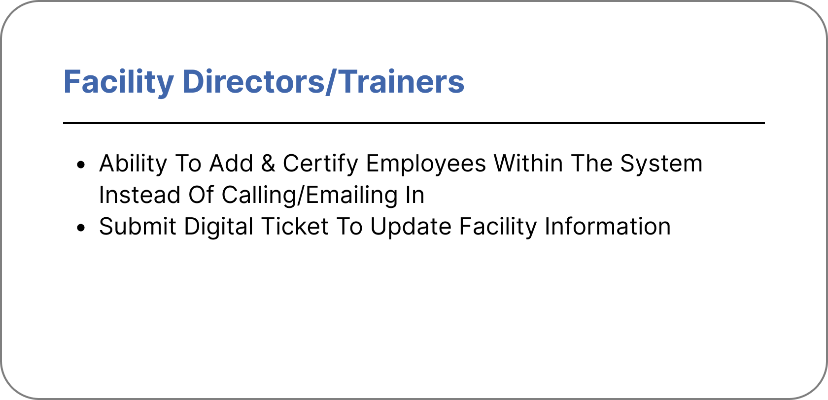
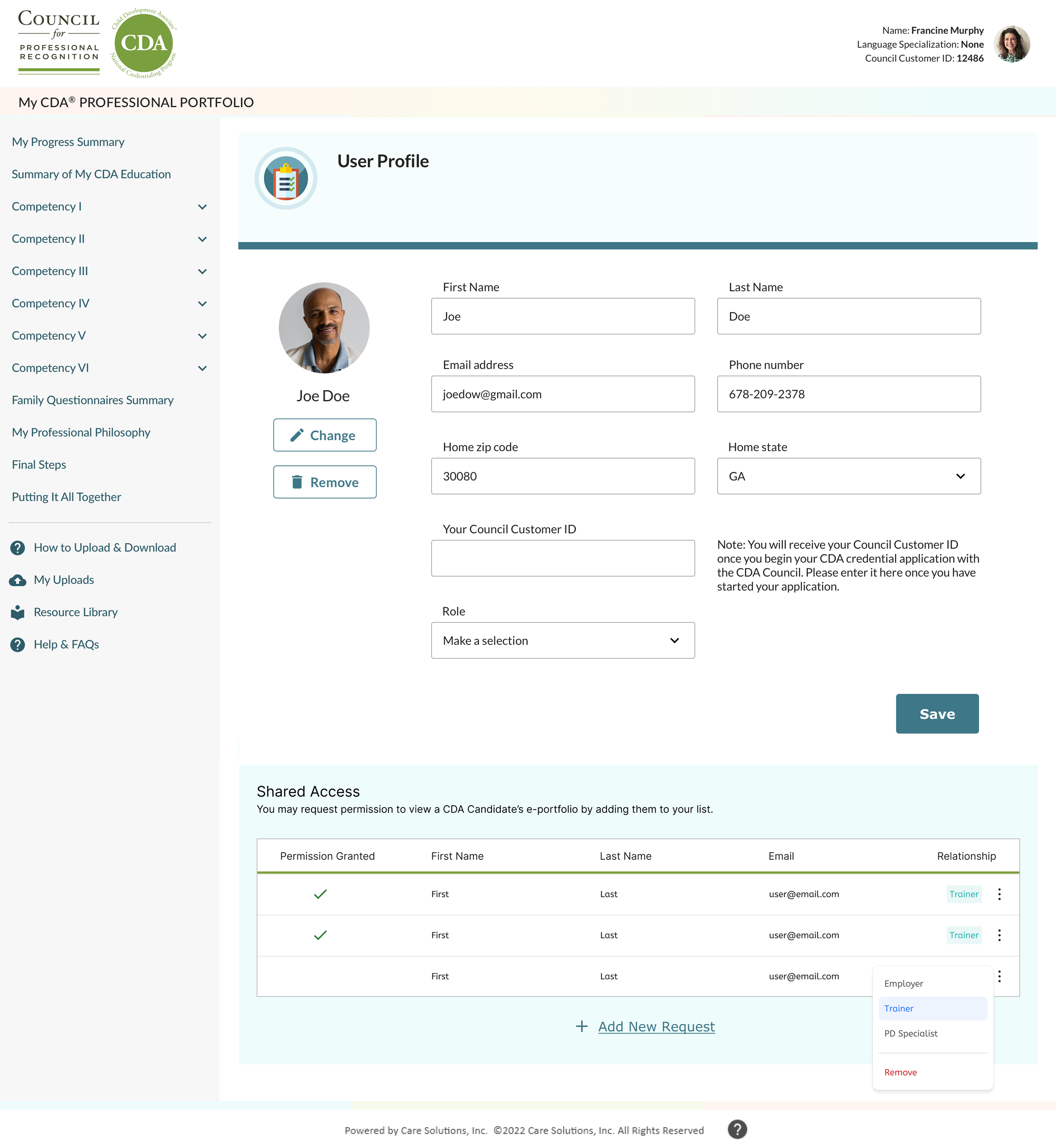
CDA was a separate program specifically for trainers. We created a portal to track all their personal coursework and their student/course information. The function to view and approve students online was an improvement from the prior flow of email verification for each individual member. This is a functionality that we were also able to add for facility and institution level portals to verify employees.

Finance Portal
A much needed portal was the finance specific portal. It provided extra security and digitized the invoicing flow. This was important to increase ease of use and allow for quick edits and tracking. Project owners and I were able to introduce numerous new features to reduce the steps of creating and sending invoices. This shortened the turnaround time for when applicants can receive their funding, and it created a centralized history log for government.
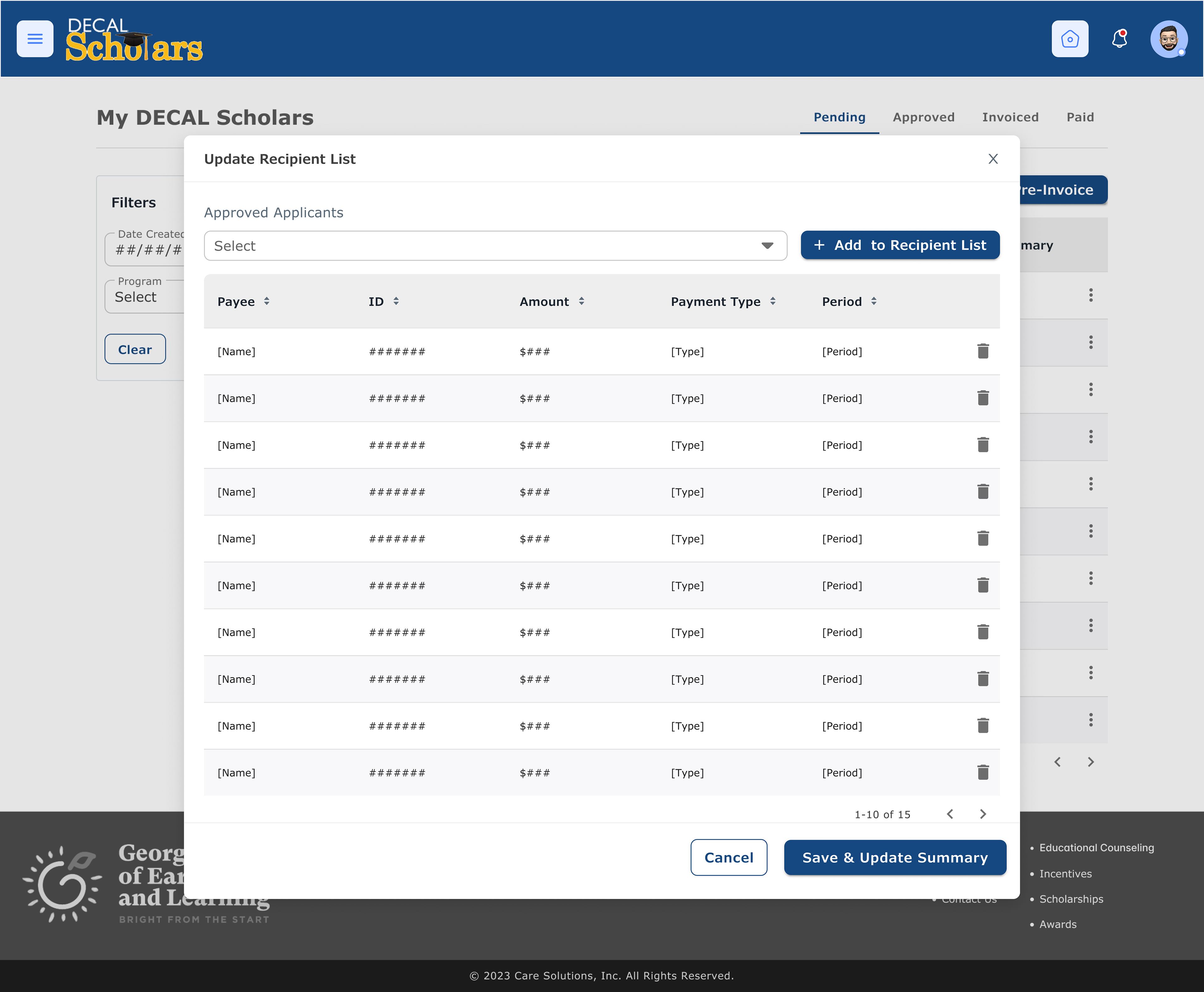
New feature: edit recipient list
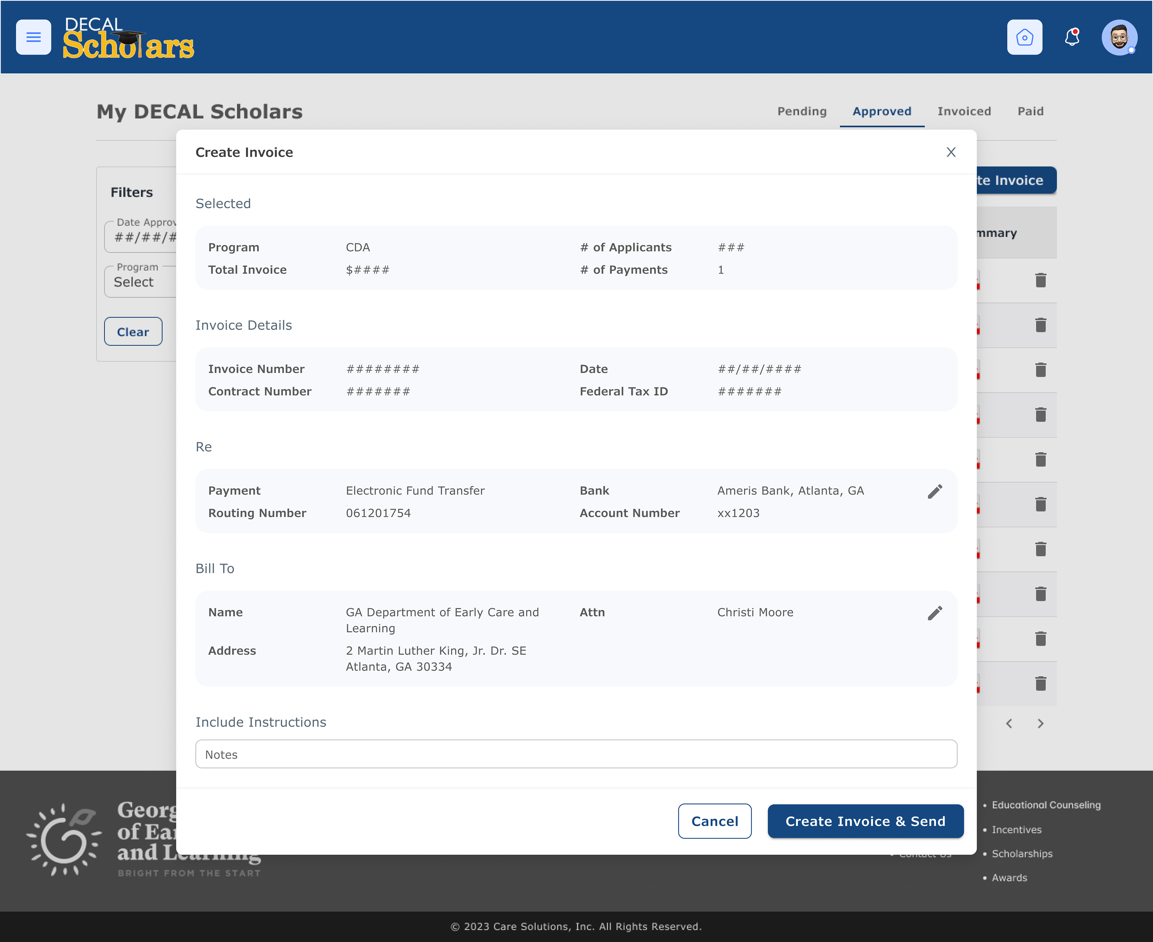
New feature: create digital invoice & add notes if needed
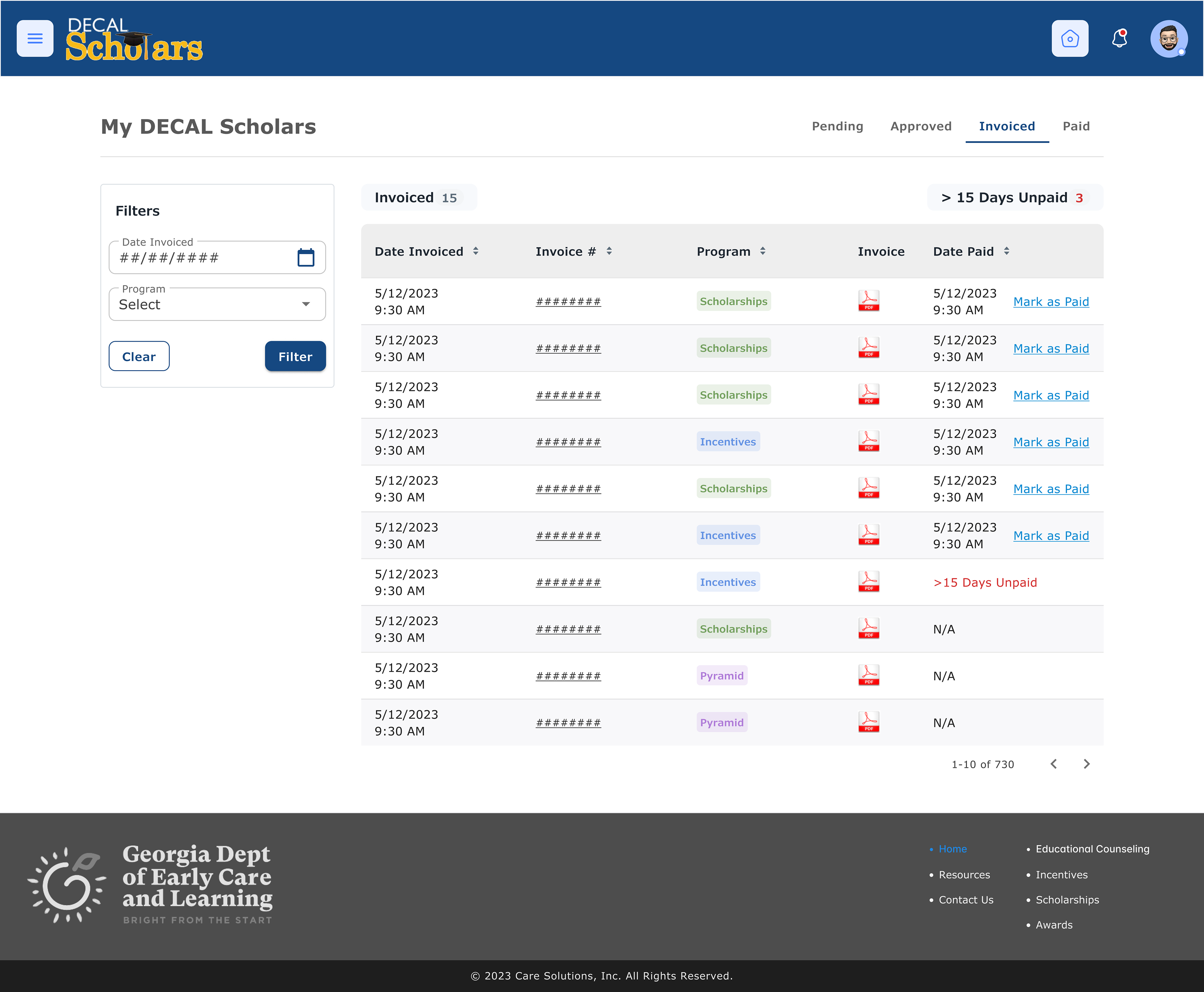
New feature: alerts for late payments
Improvements for Government Level
CareSolutions needed a new portal for government level admin to track program participation and to introduce a submission process for creating new programs. The program trackers would display quantitative data for funding needs and flows, and the diversity of applicants whether individuals or facilities/institutes. Ideally, our company wanted to showcase how invaluable these resources are. We wanted to encourage the possibilities of running and managing even more future programs to benefit early childcare educators.
Modular Blocks
I created modules for data collection blocks and their correlating processing page components. By having these one-to-one pages, developers and I began exploring the operation of a system to allow government level staff to design and implement programs on their own. These modules also each included their necessary automations. With these premade, developers can quickly combine the code needed, and admin staff can easily onboard into processing.

Customize & Create Programs
Our next businesses goal was to allow government program managers to submit a request to create new early childcare funding programs. This would speed up and simplify the process on both ends by allowing the government to view a sample application immediately. The new system would allow customization within reason, set automated program parameters and track any custom requests.

