Miaplaza
User Experience Designer for Online Homeschooling Program
TOOLS
UI/UX: Figma, Adobe XD, Adobe Photoshop
Graphic/Motion Design: Adobe Illustrator, Adobe After Effects, Adobe Premiere Pro
User Research: usertesting.com, Zoom, Google Forms, Google Excel, Adobe InDesign
UI/UX: Figma, Adobe XD, Adobe Photoshop
Graphic/Motion Design: Adobe Illustrator, Adobe After Effects, Adobe Premiere Pro
User Research: usertesting.com, Zoom, Google Forms, Google Excel, Adobe InDesign

Context
Miaplaza has 3 active sites under its banner: Miacademy, Always Icecream, and Clever Dragons. As the company has never hired a designer since the company's launch, there were many design challenges backlogged from the past 8 years. The first challenge was to understand the current users and to decide next steps including a broad direction for the company. The company onboarded me as they were facing their first two major shifts: changing from a supplemental educational website to a full curriculum homeschooling program and launching a high school focused website.
Challenges
- no design system in place: building a design system while continuing to make prototypes for issues caused roundabout work and redundancies
- startup environment: no set process, constantly switching between programs, experimental mindset for addressing sprints
What I learned
- how to quickly block together a placeholder design system and components to improve the speed of prototype building
- focus on users and user testing to make sure solutions are concise and clearly solve issues
- how to work directly with stakeholders and obtain necessary information from different teams to push a project to next steps
- learned about SEO and marketing to help with placeholder texts for prototyping and making templates for company posts

Animated our logo for educational video intros
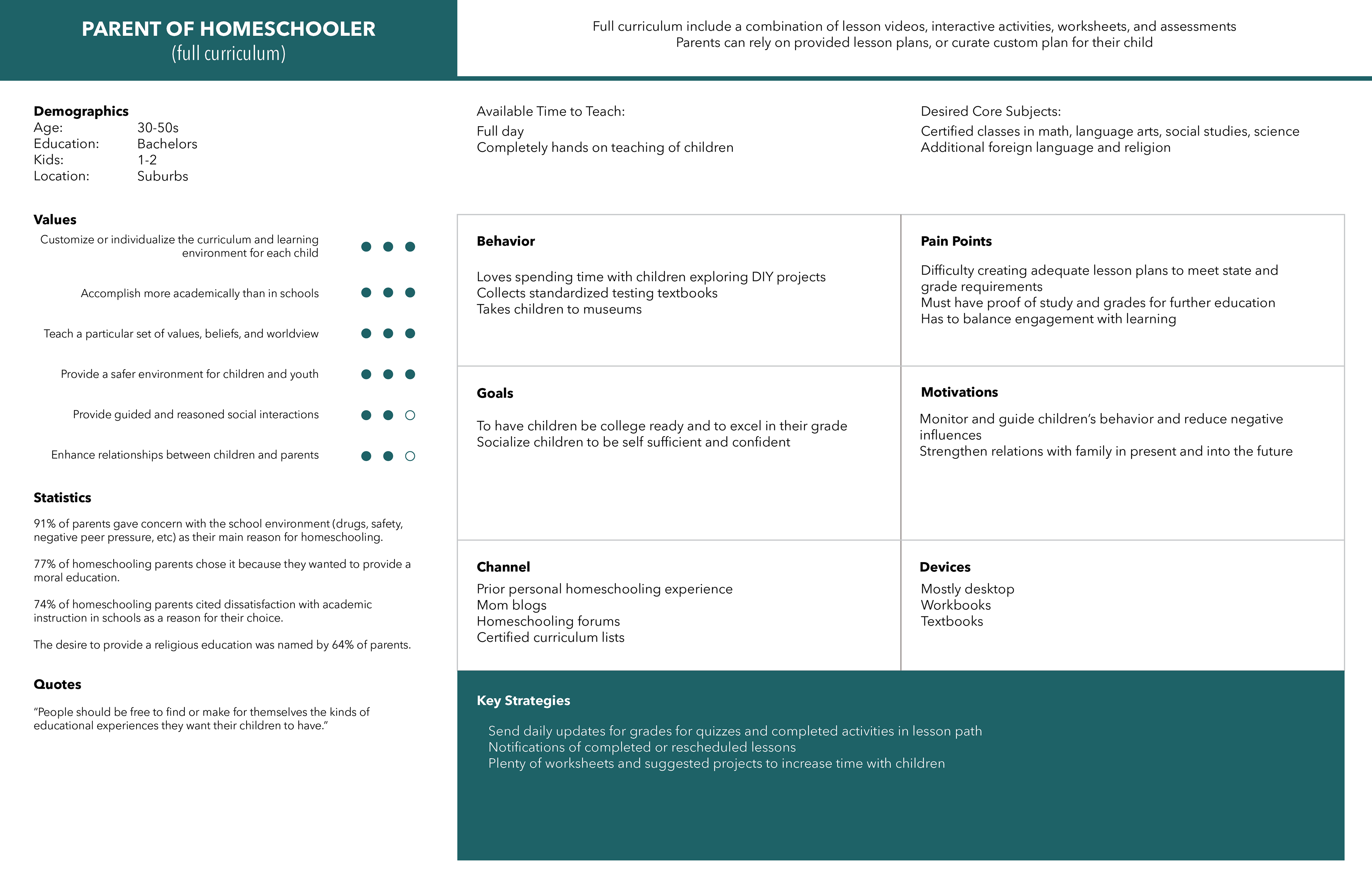
Initial Research
Current Customers & Trends
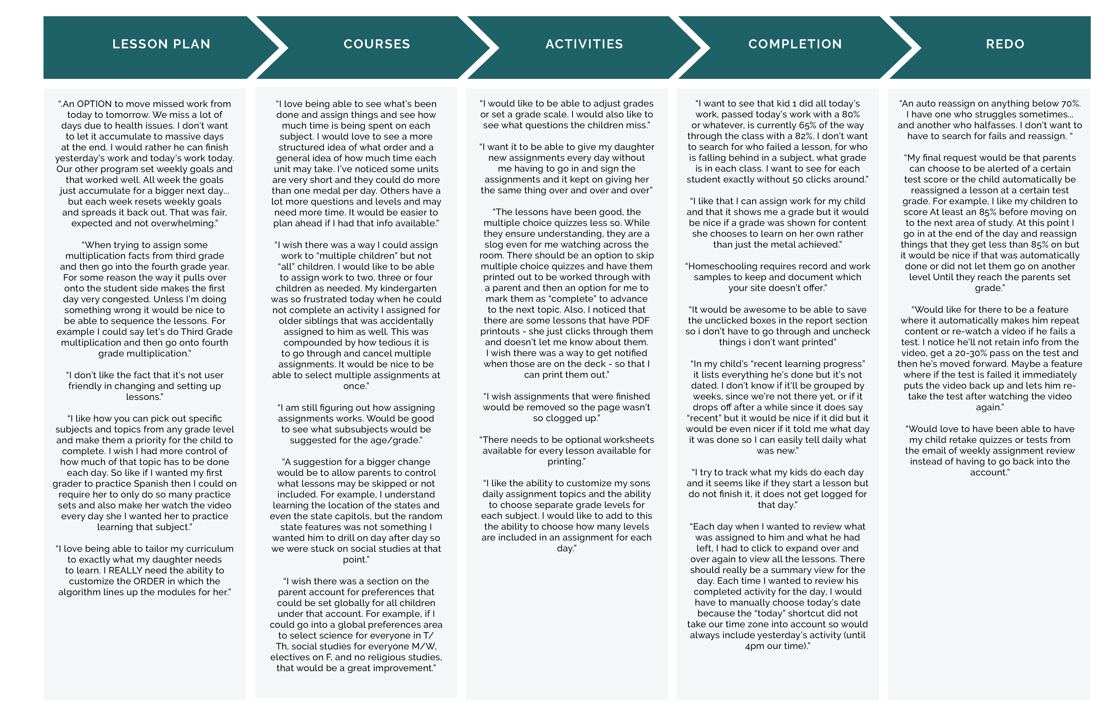
Understanding the customer base and ongoing needs is the first step in understanding a website. Personas of the 8 core user groups: parents and children using full curriculum, supplemental, free schooling, or newly transferred from public school. Using surveys and interviews with current users to gather insights on ongoing needs.
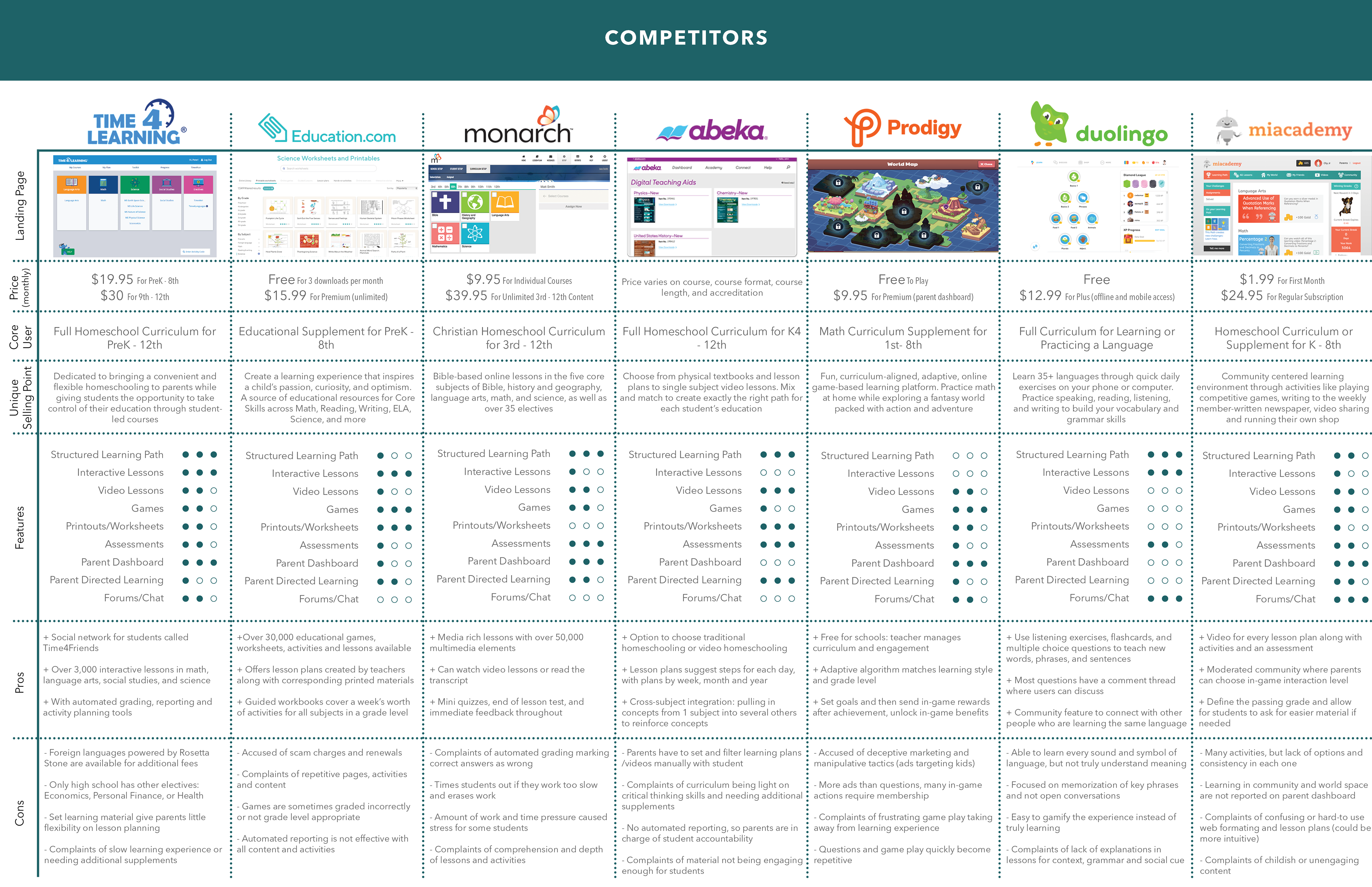
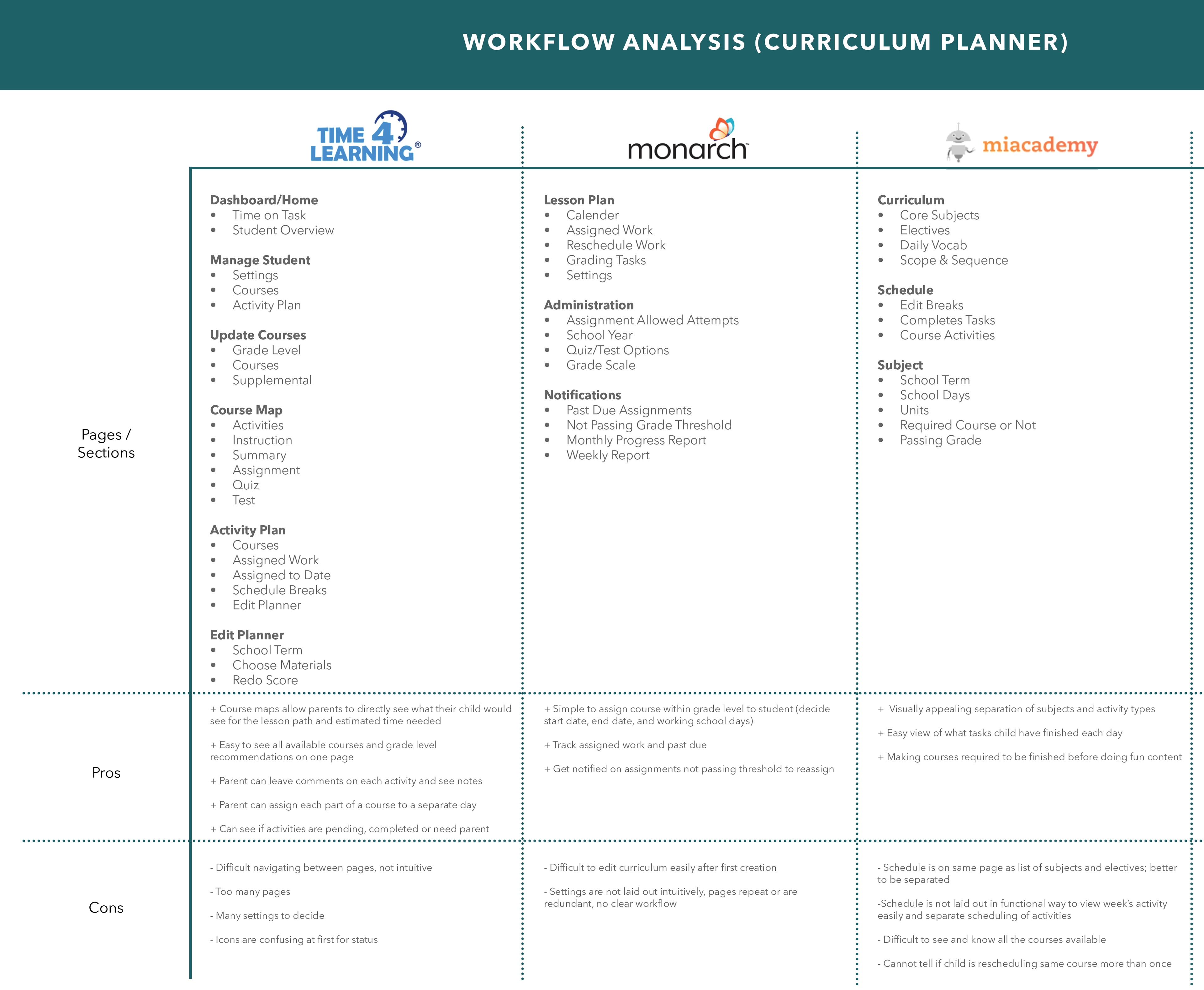
Competitors
Understanding competitors is important in setting baselines of where to improve
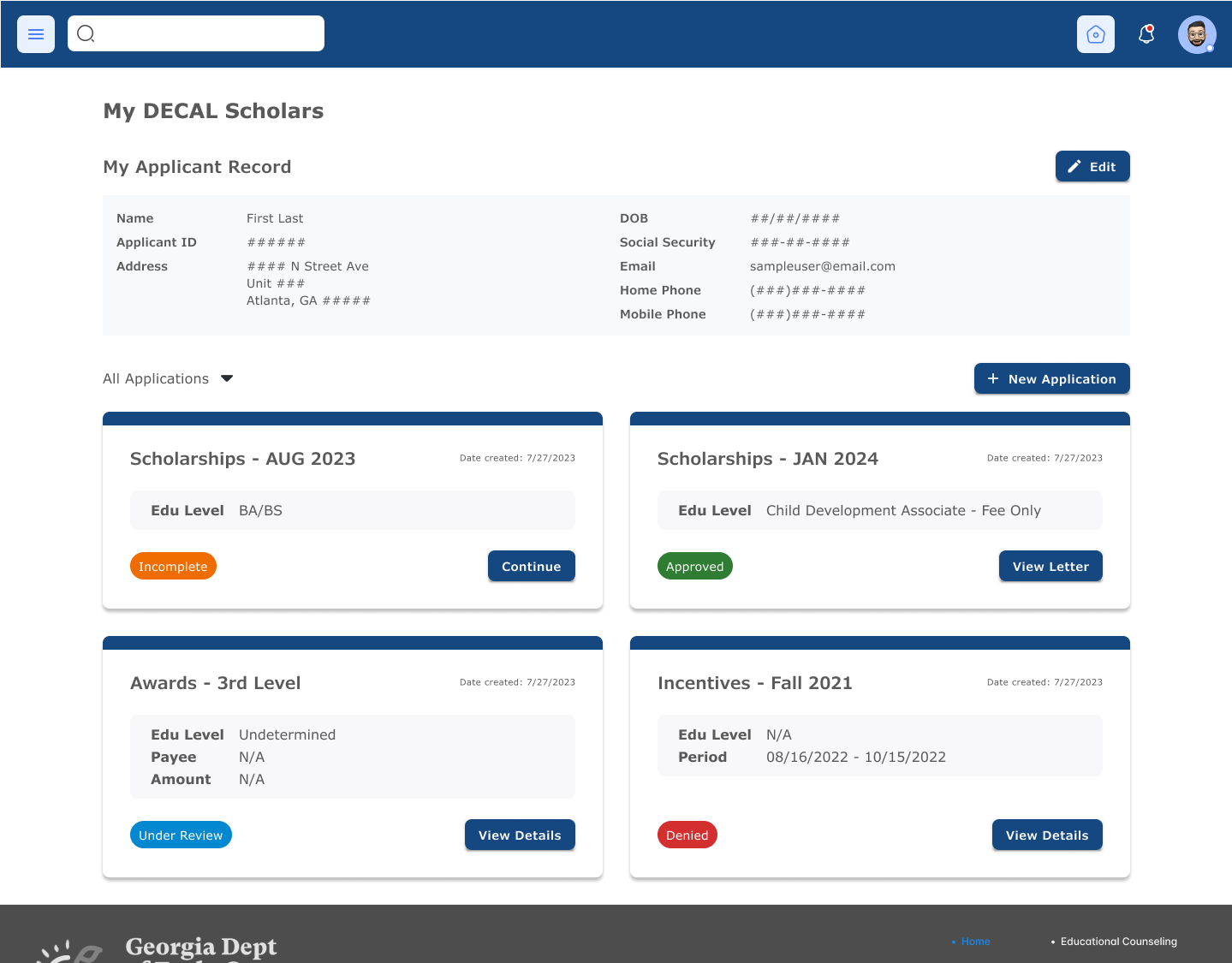
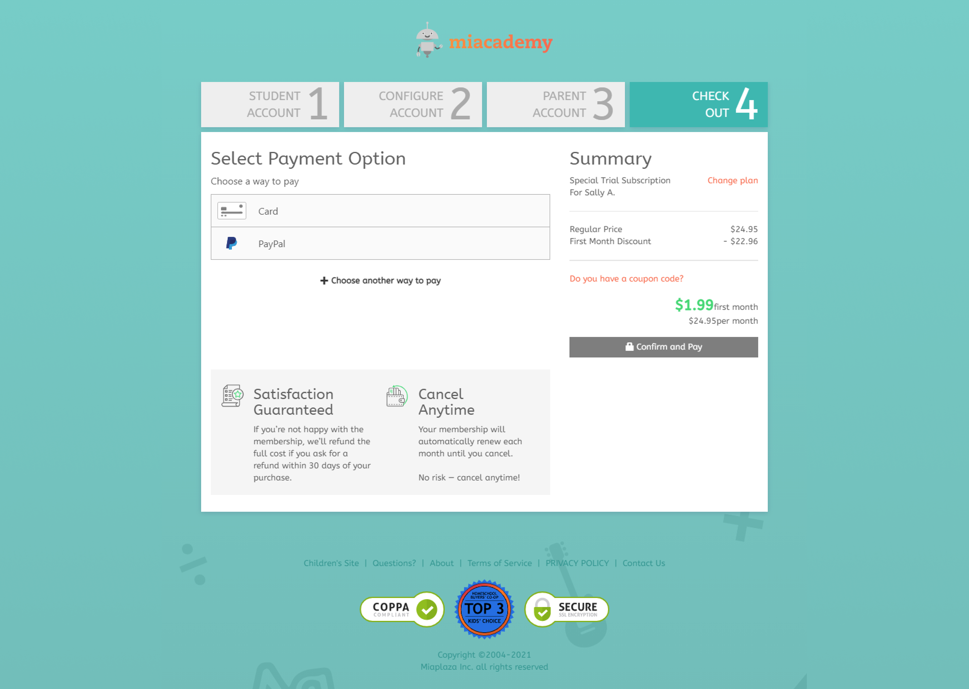
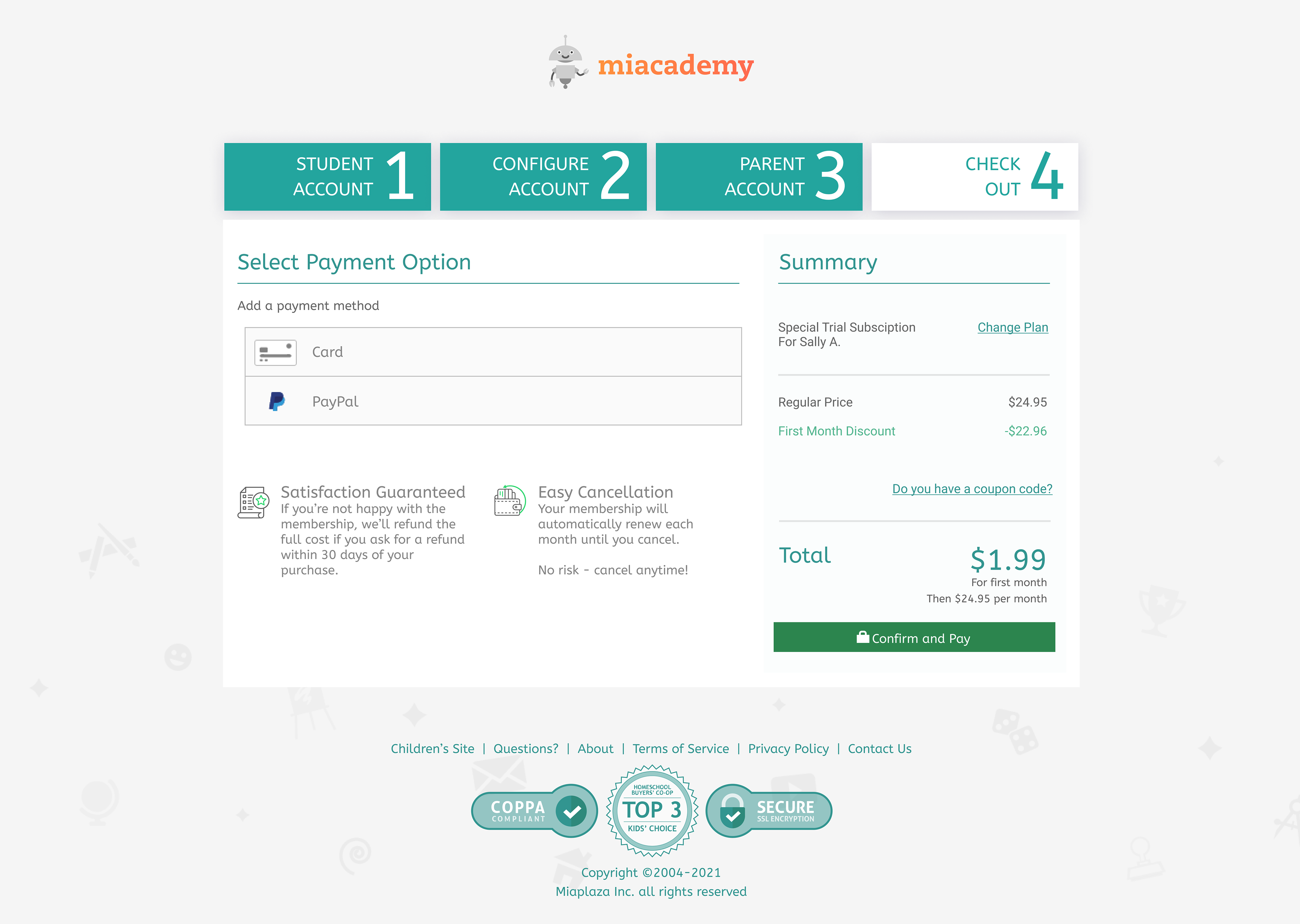
Sign Up and Payment Flow Redesign
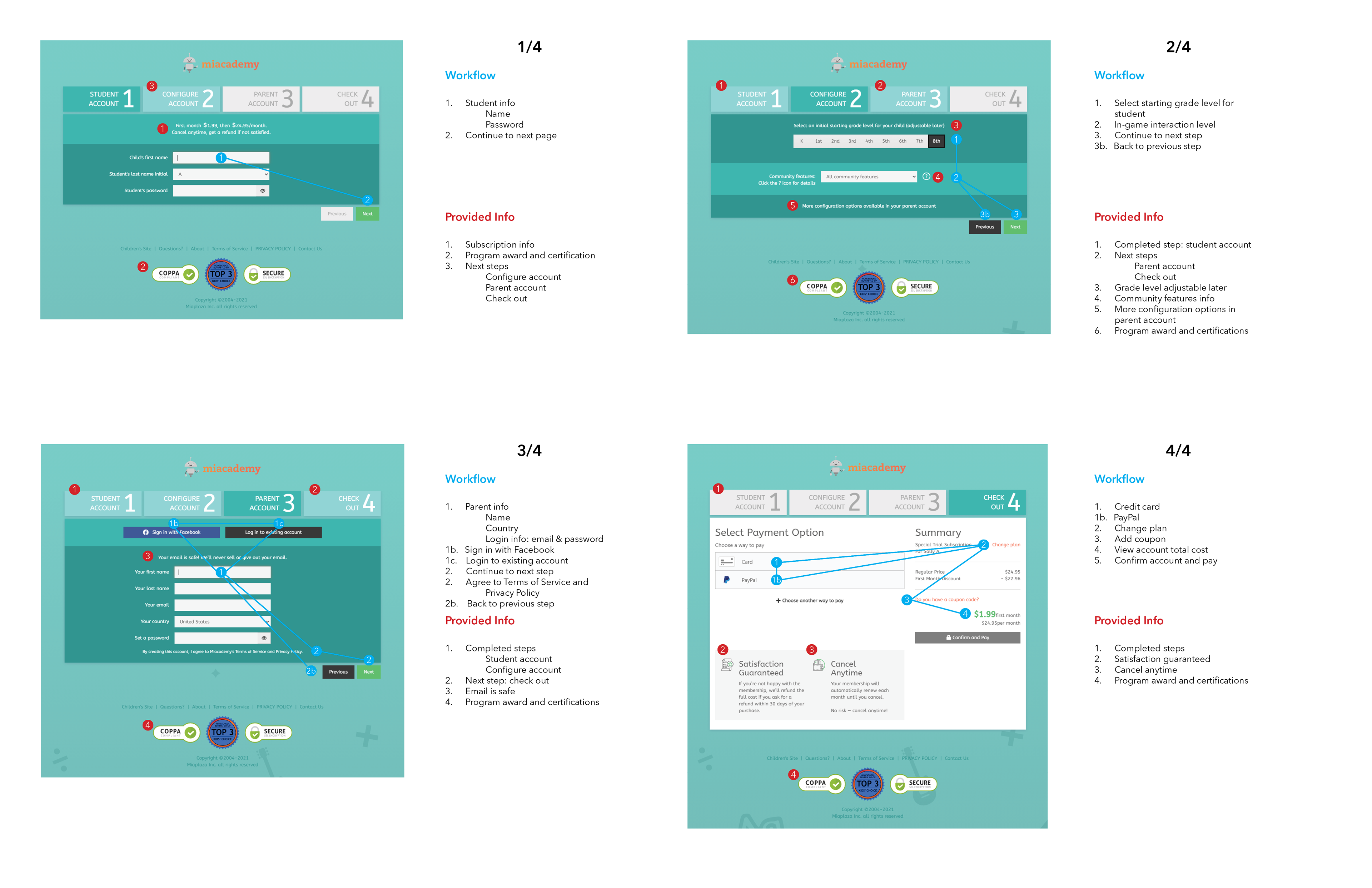
There were many complaints that the sign up process is confusing and parents did not understand how to add more than one student to their account. Miaplaza websites had a unique account creation setup where the parent account had to be created first and only one student can be added by default. Customer service had to regularly walk people through the signup process.
Page Flow Analysis
Redesigning signup requires simplifying the page content as much as possible and clearly show customers the necessary information to get to the next step in the process.
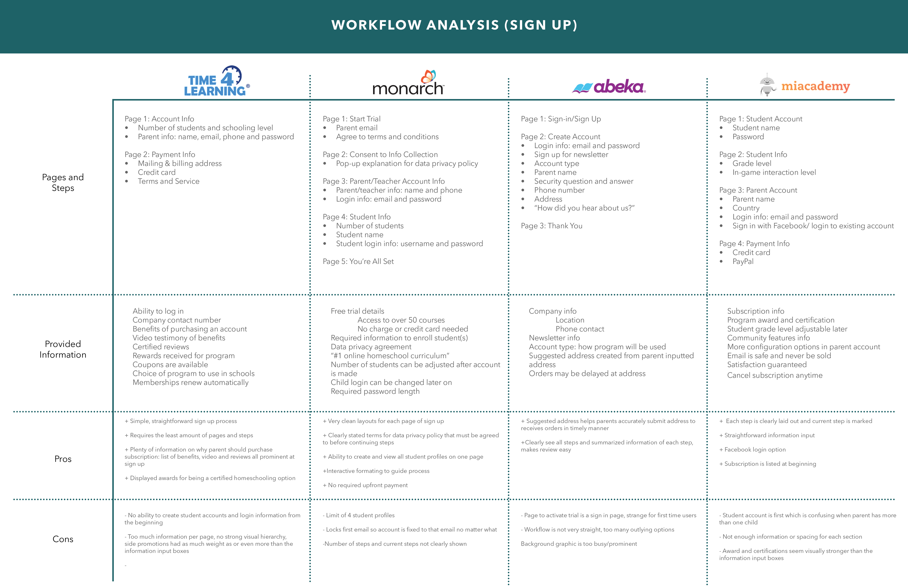
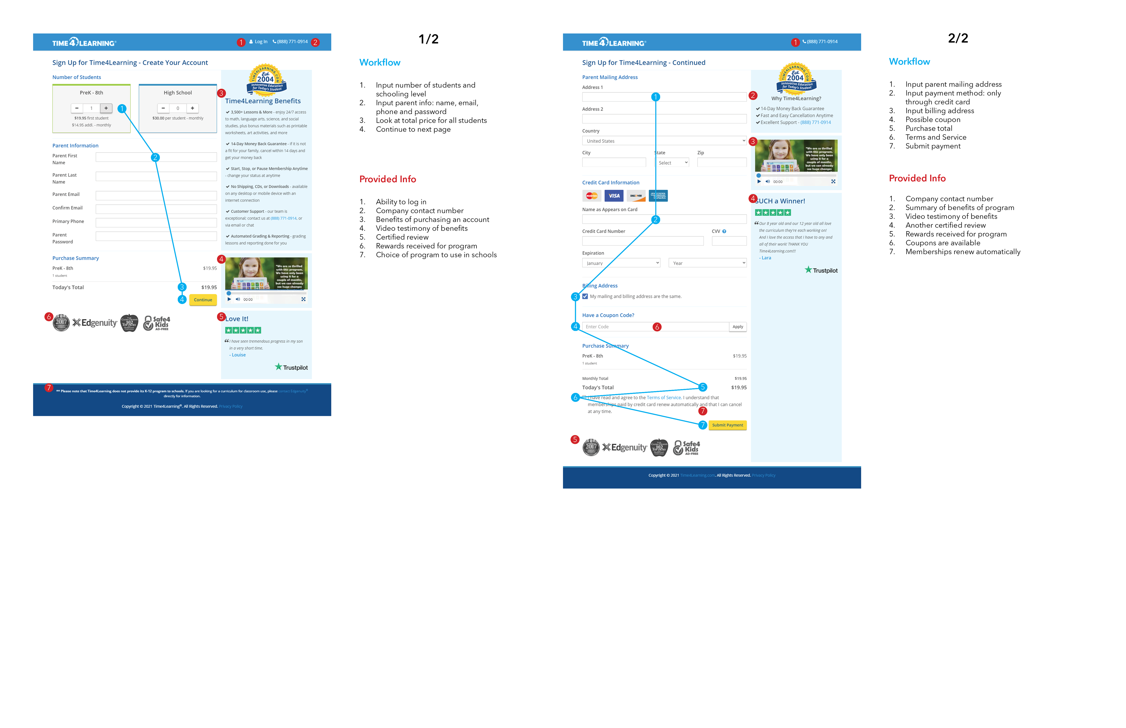
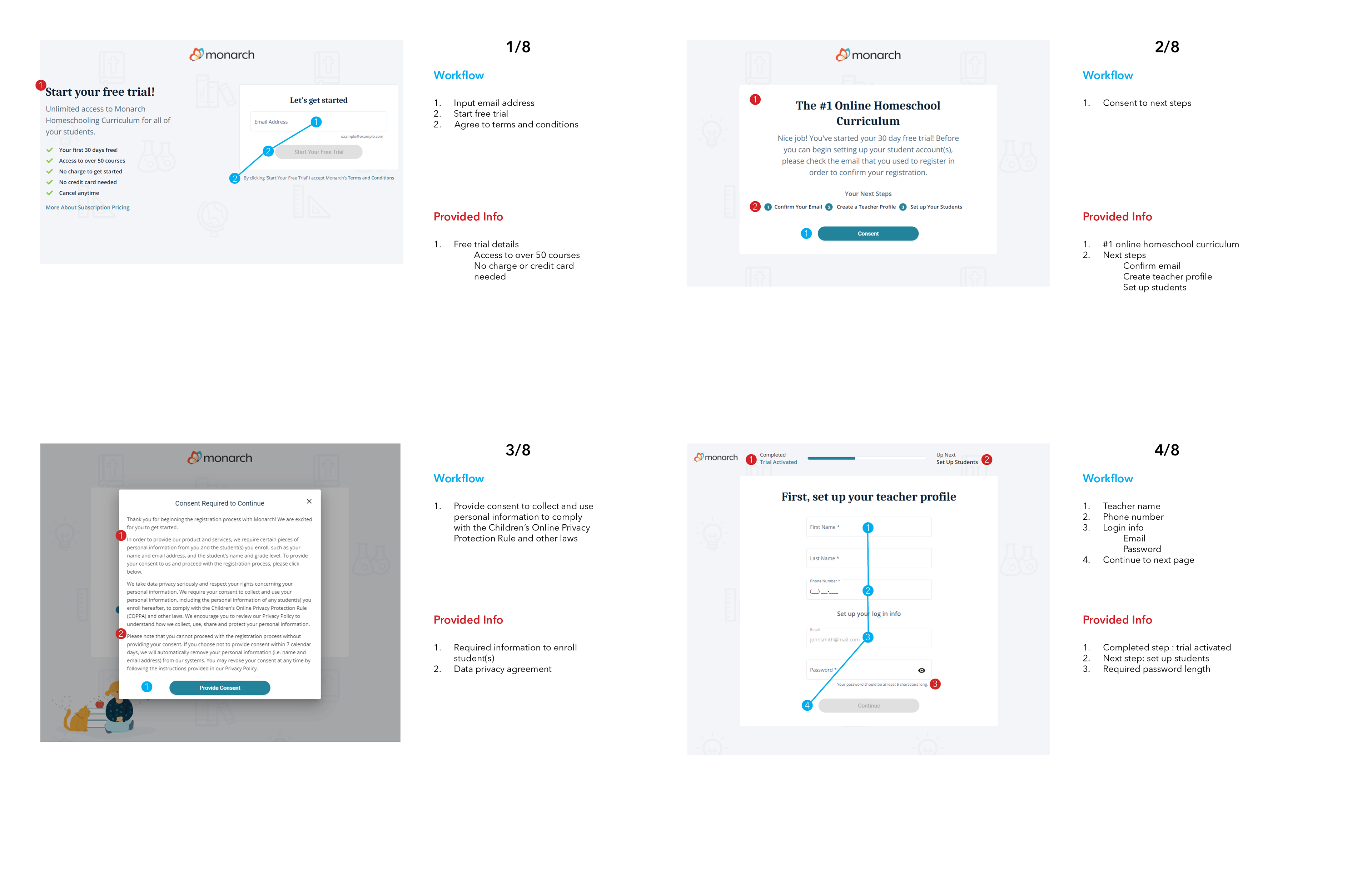
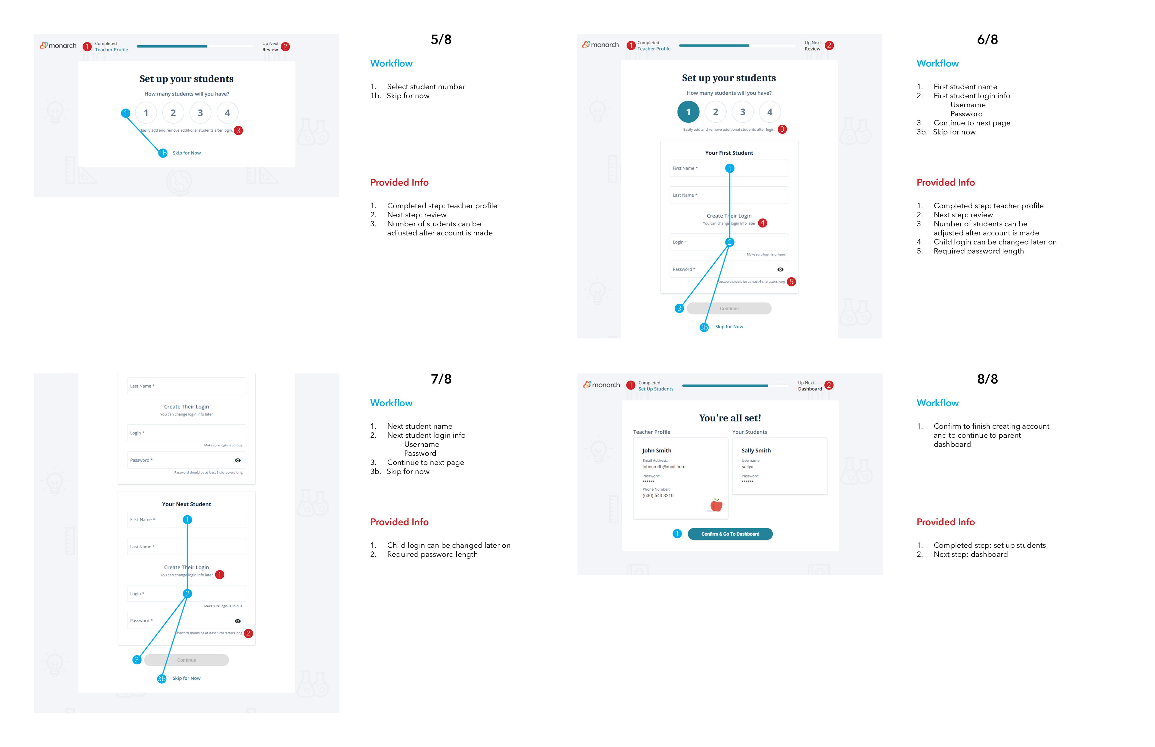
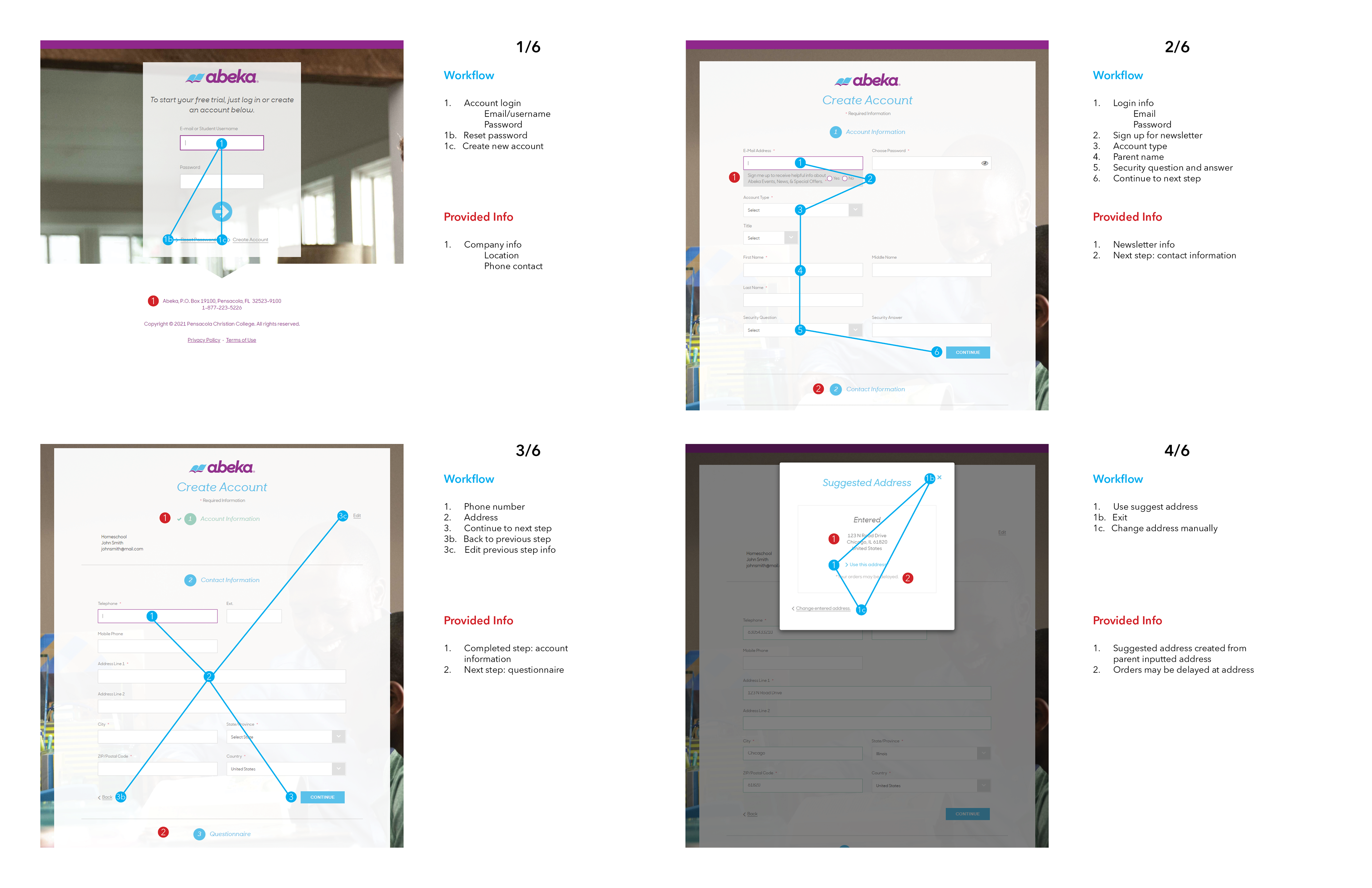
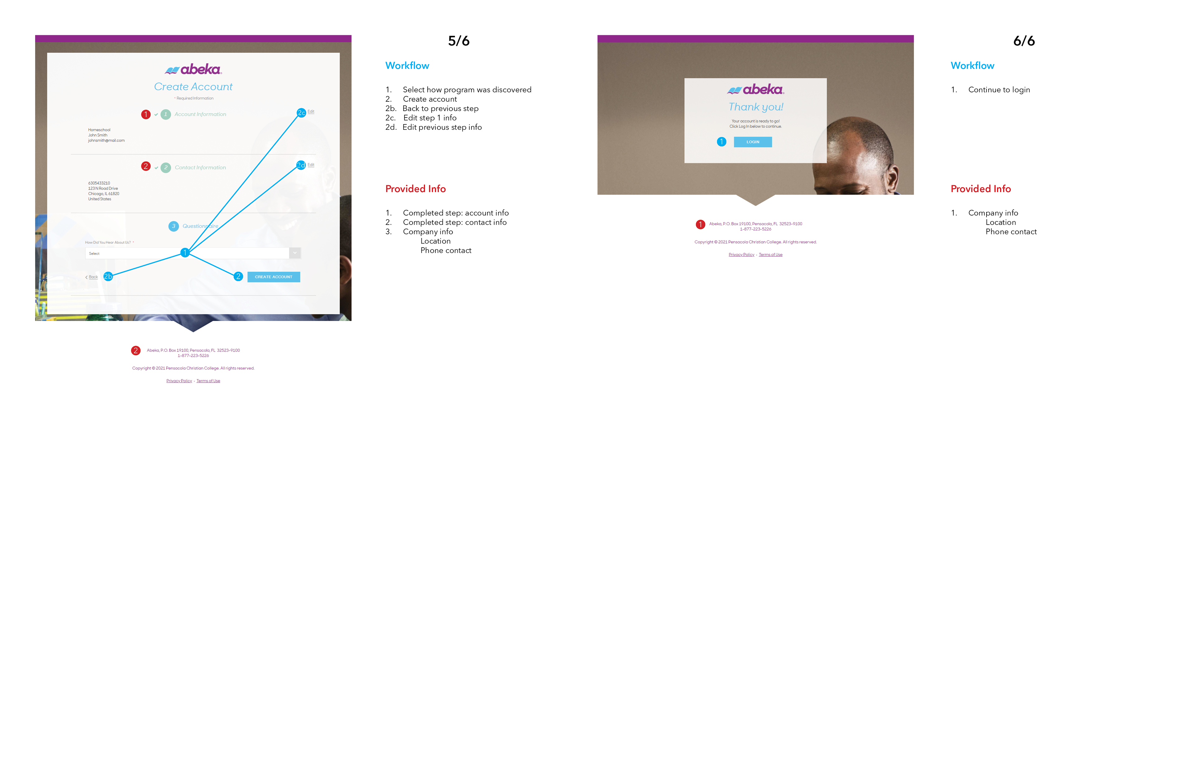
Using competitors to understand sign up flows
Redesign Criteria
- Defined information hierarchy to allow new users to understand the steps for signup
- Reorganized design system and colors for legibility and clarity
- Worked with developers to understand limitations for updating components and creating new states
- Designed information popups to provide more context without making pages heavier
- Simplified user flow by removing redundant steps and buttons

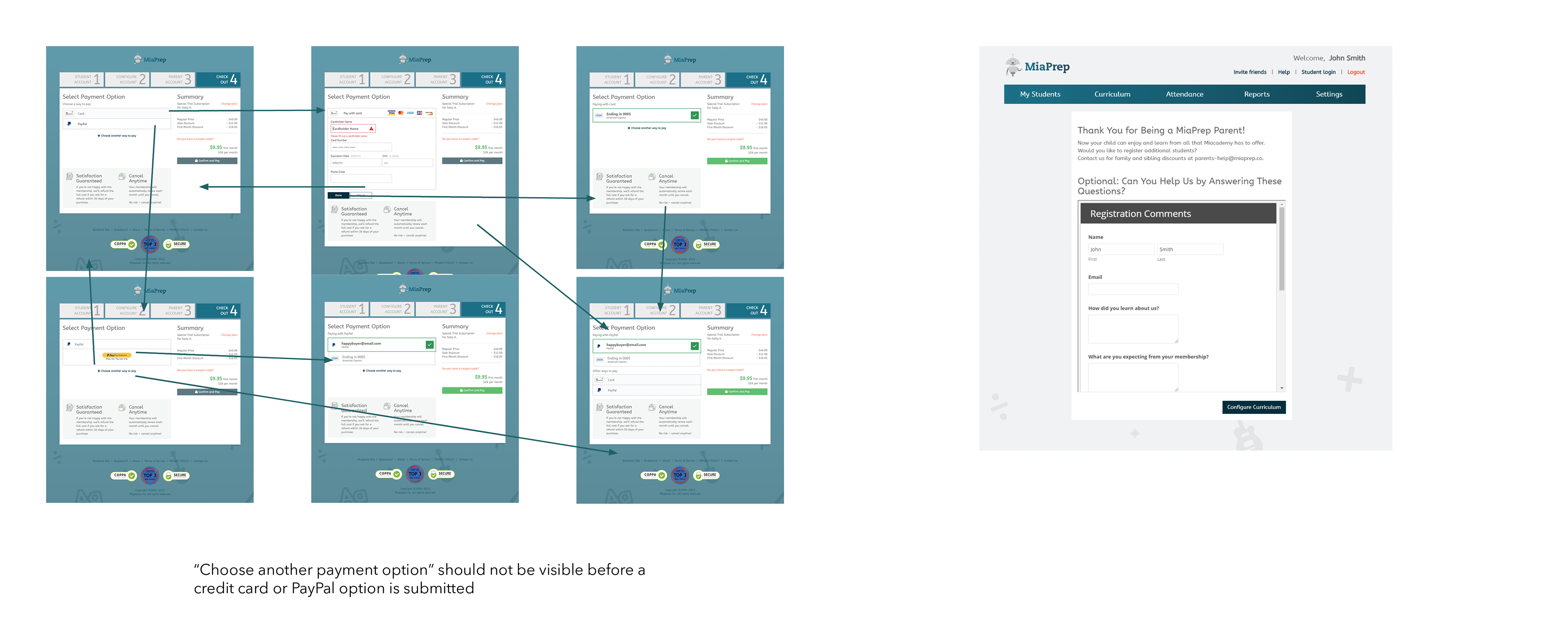
Sample Sprint Mockup for UI Update
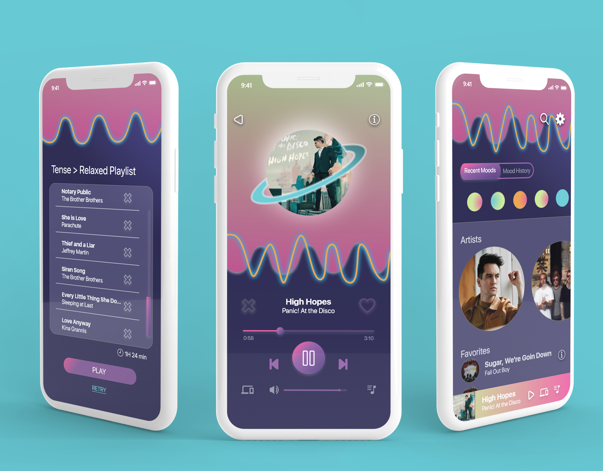
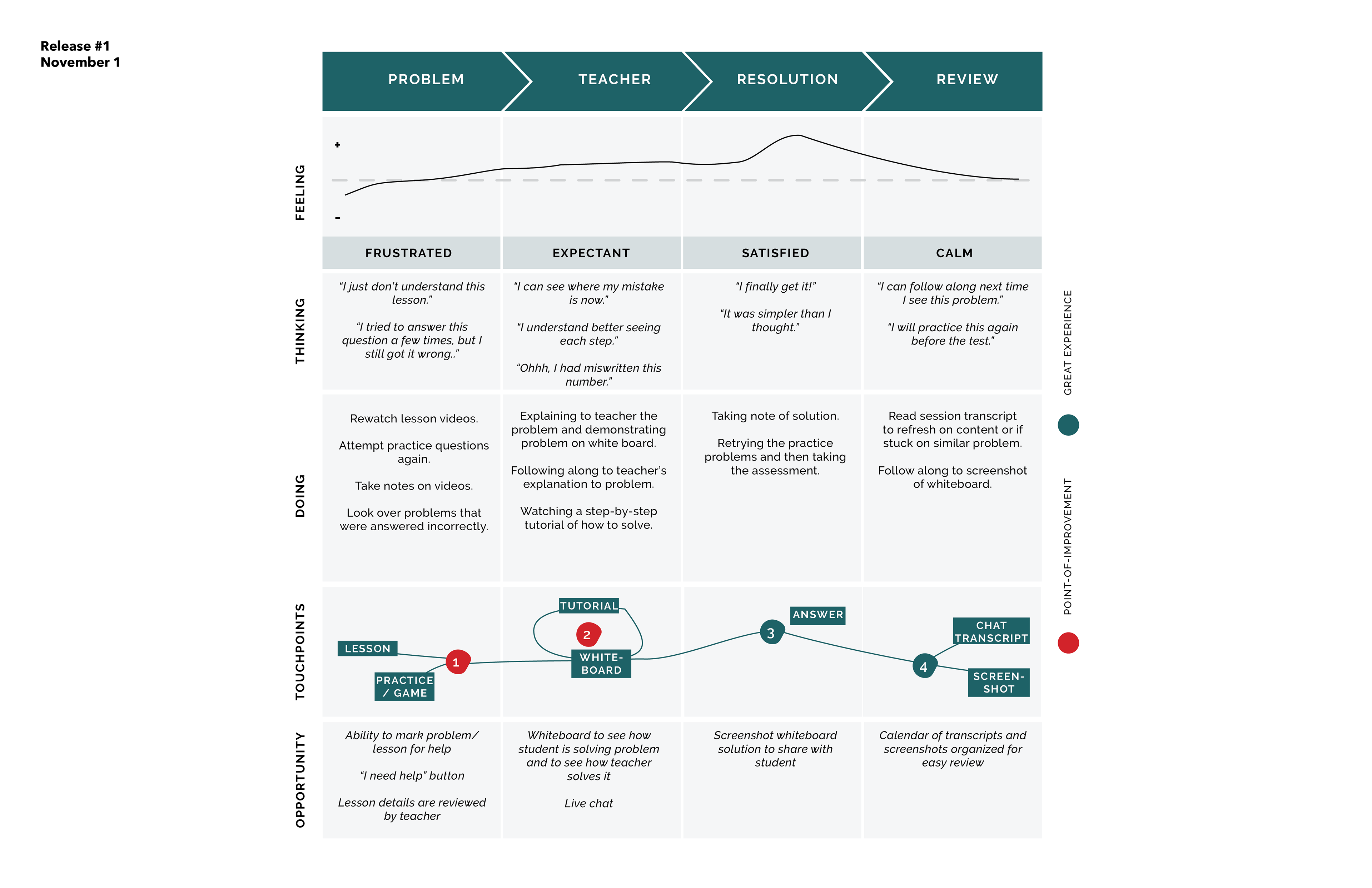
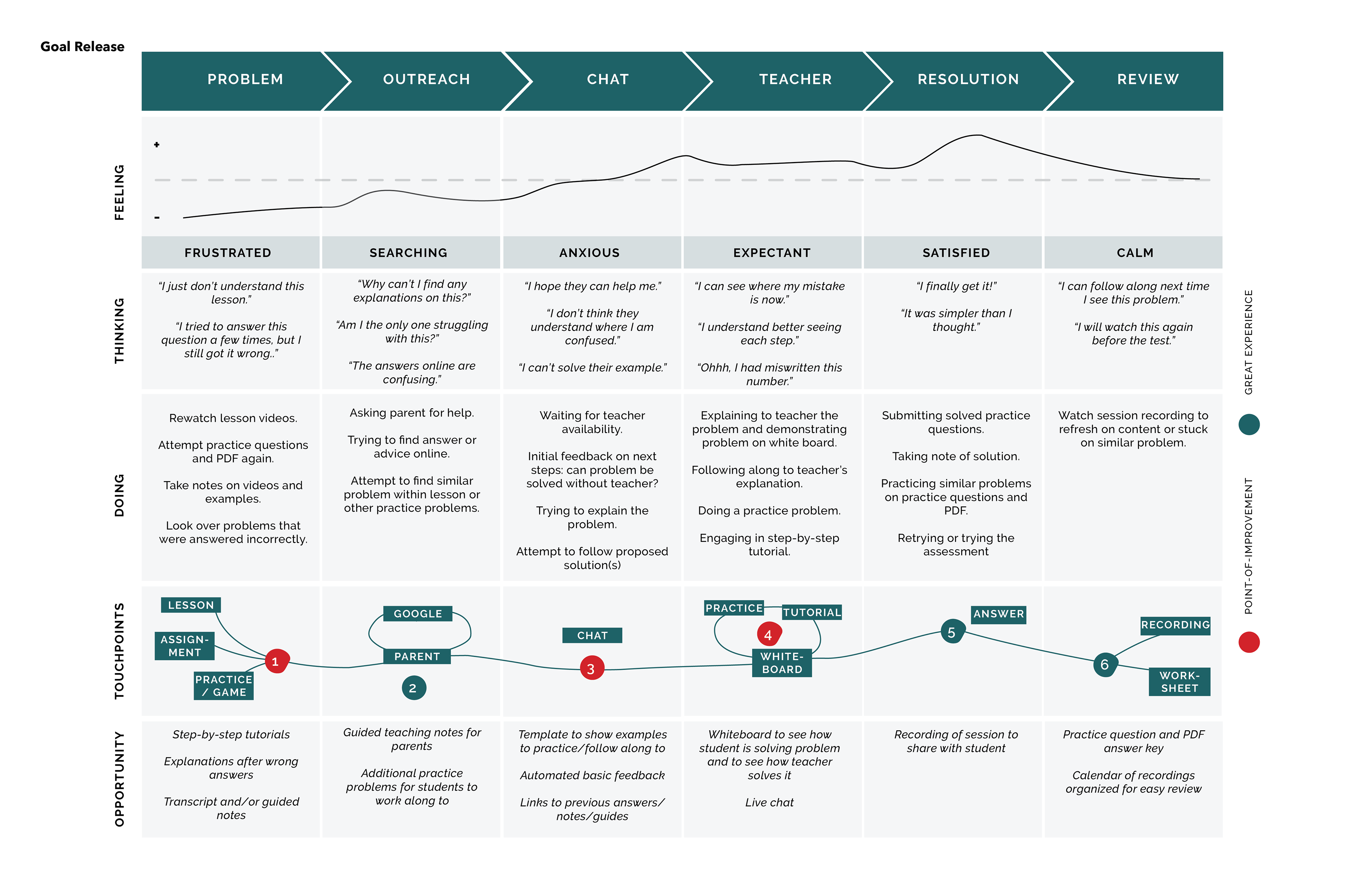
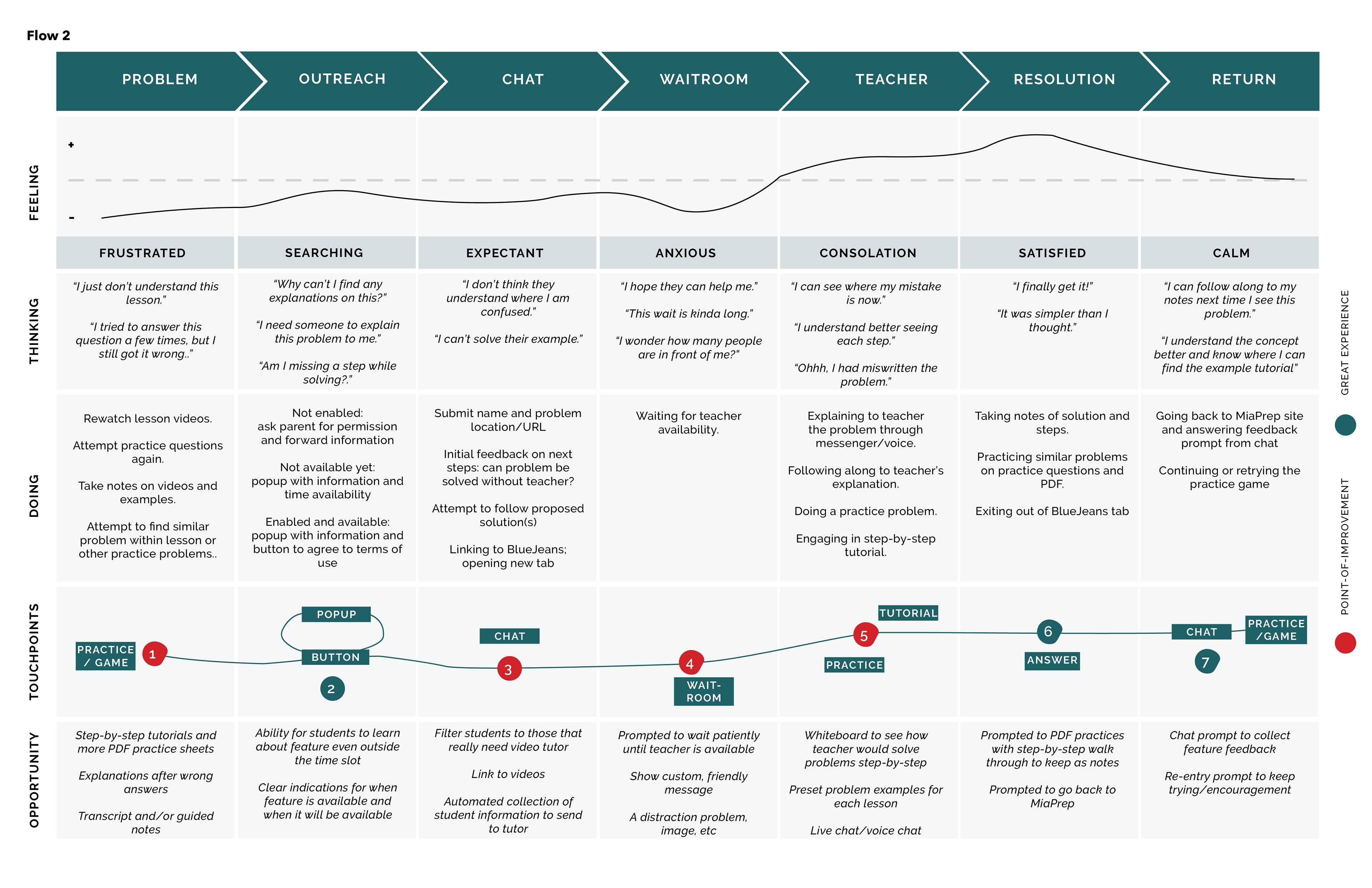
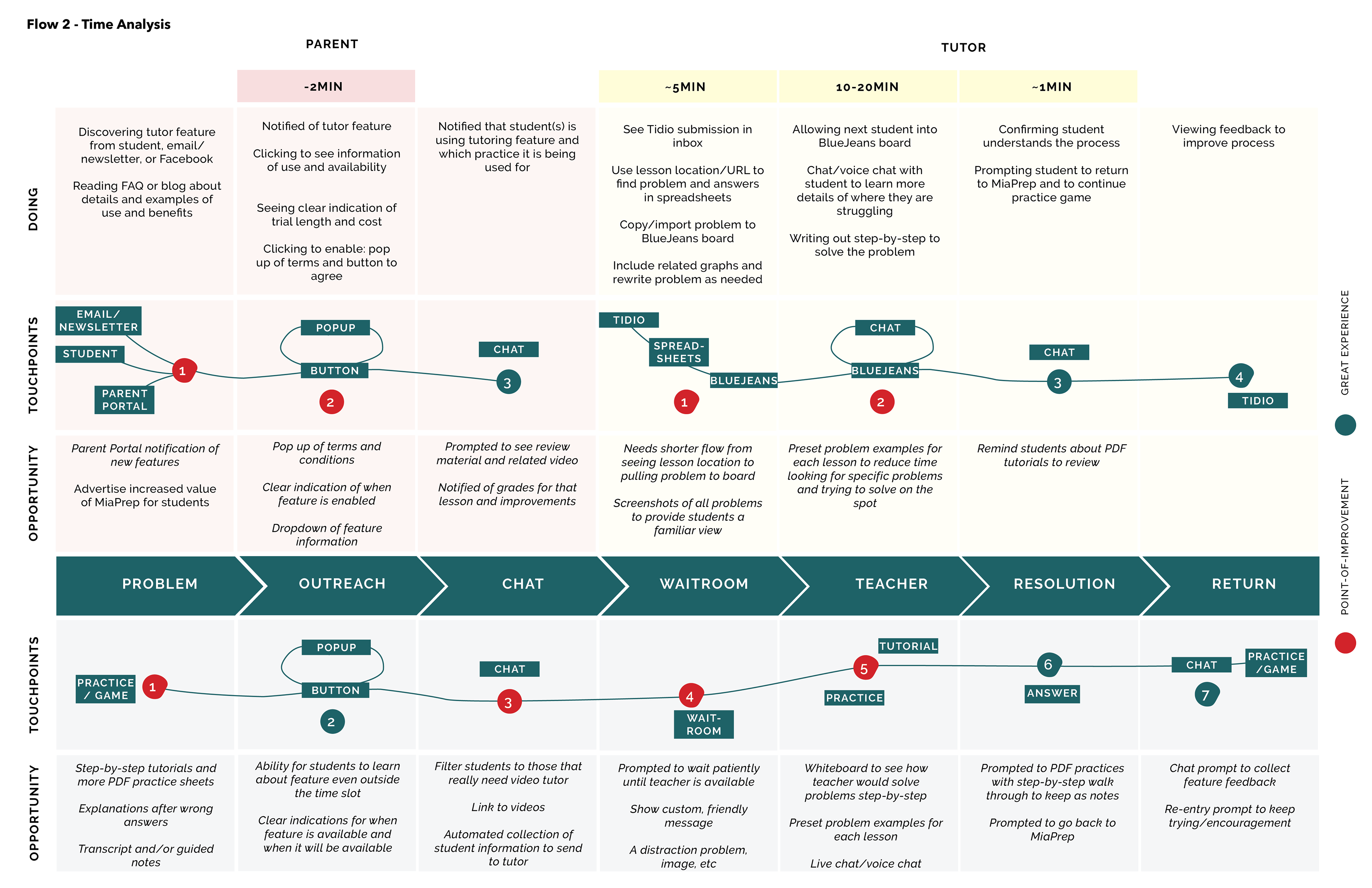
Proposing New Tutoring Feature
Miaplaza launched a high school program and wanted a differentiating feature for the new site.
Breaking Down Experience Flows
Working with stakeholders and content creators to create several possible tutoring flows. Laid out the ideal experience and worked with developers to understand the current site's constraints. Created more realistic rounds of development. Also test the experience within employees that are unfamiliar with the new proposal.
Curriculum Page Redesign
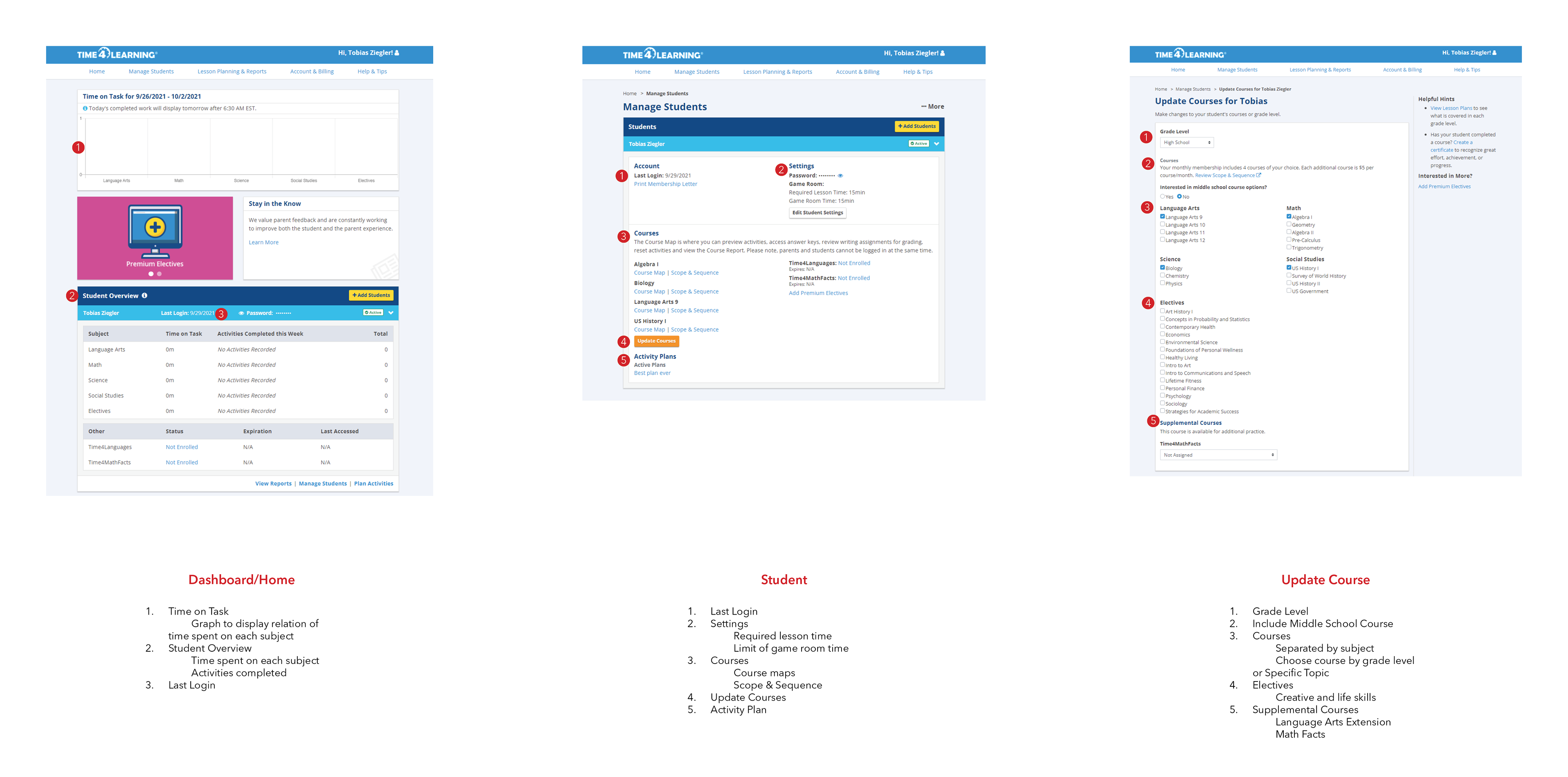
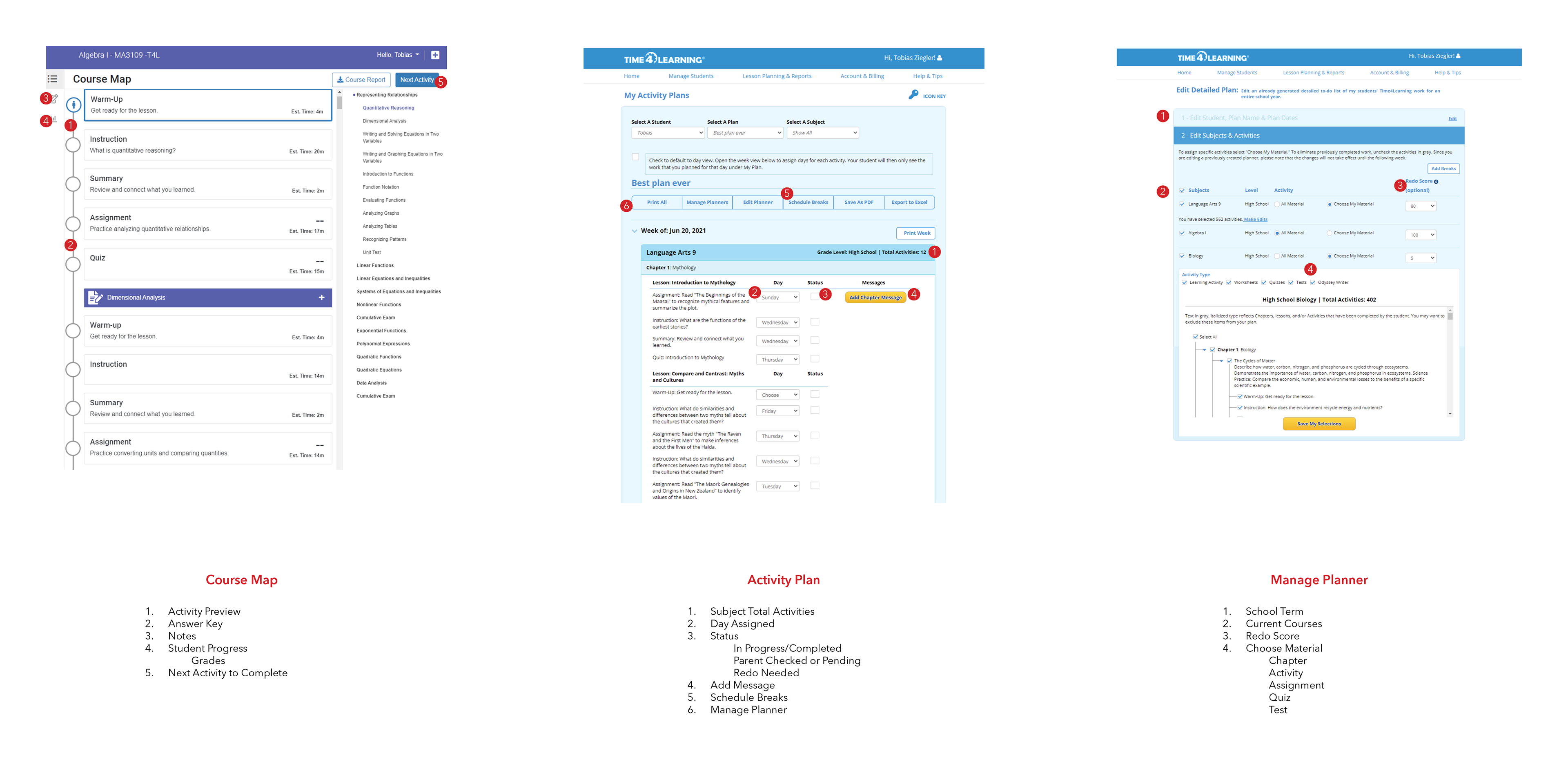
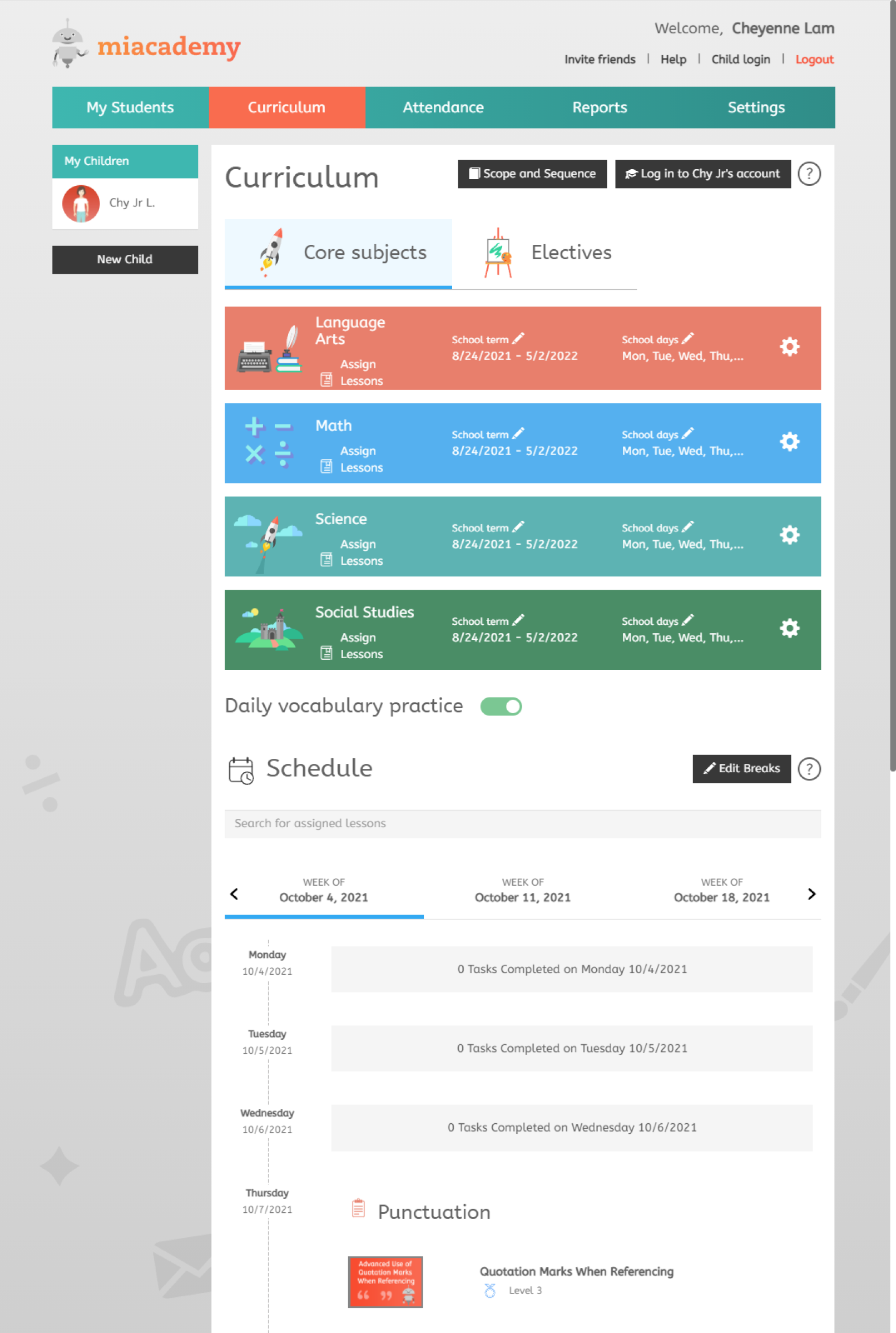
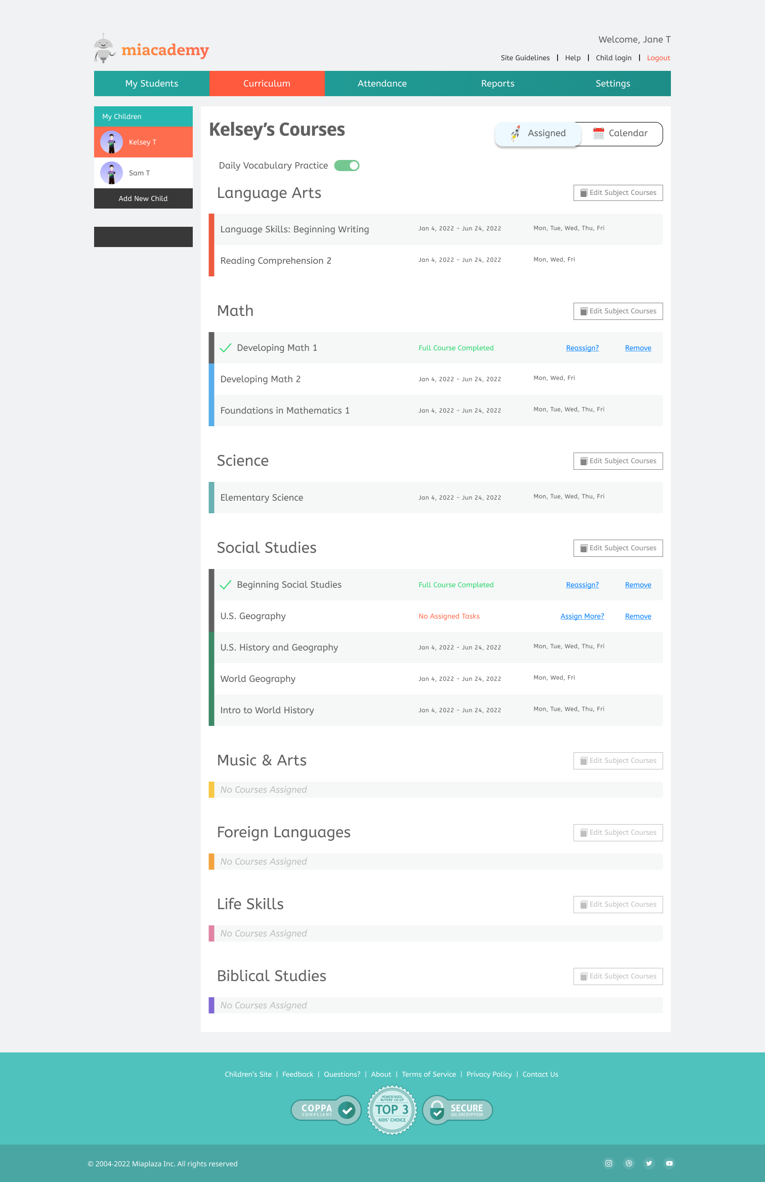
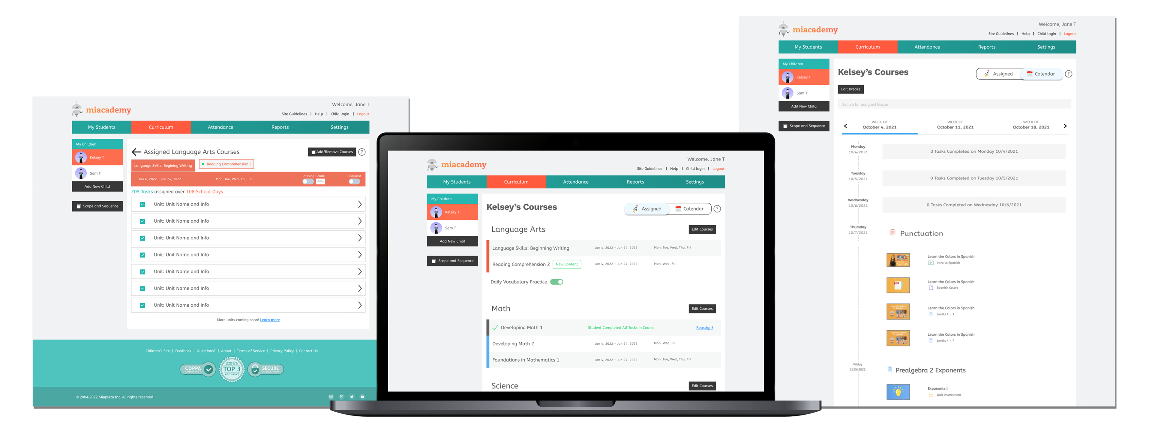
As Miaplaza switched from an enrichment program to a full curriculum, it was vital to redo the user journey to reflect the ability to design a student's course plan for the semester. The core change was the ability for parents to assign by course instead of by subject. It was also important for parents to clearly see all assigned work and to see if a course had been completed. Many parents expressed confusion when asked about assigning elective; they never realized it was an offering.
Old Page vs Redesign
- Simplifying the colors and graphics to increase clarity of information hierarchy
- Tagging courses that have been completed or have no current assigned tasks; add options for quick actions
- Removed side scroll component and instead showing all available courses under on a single subject page
- Ability to assign and unassign multiple courses at once
- Separated Schedule to reduce load time of page and to allow for future updates of features
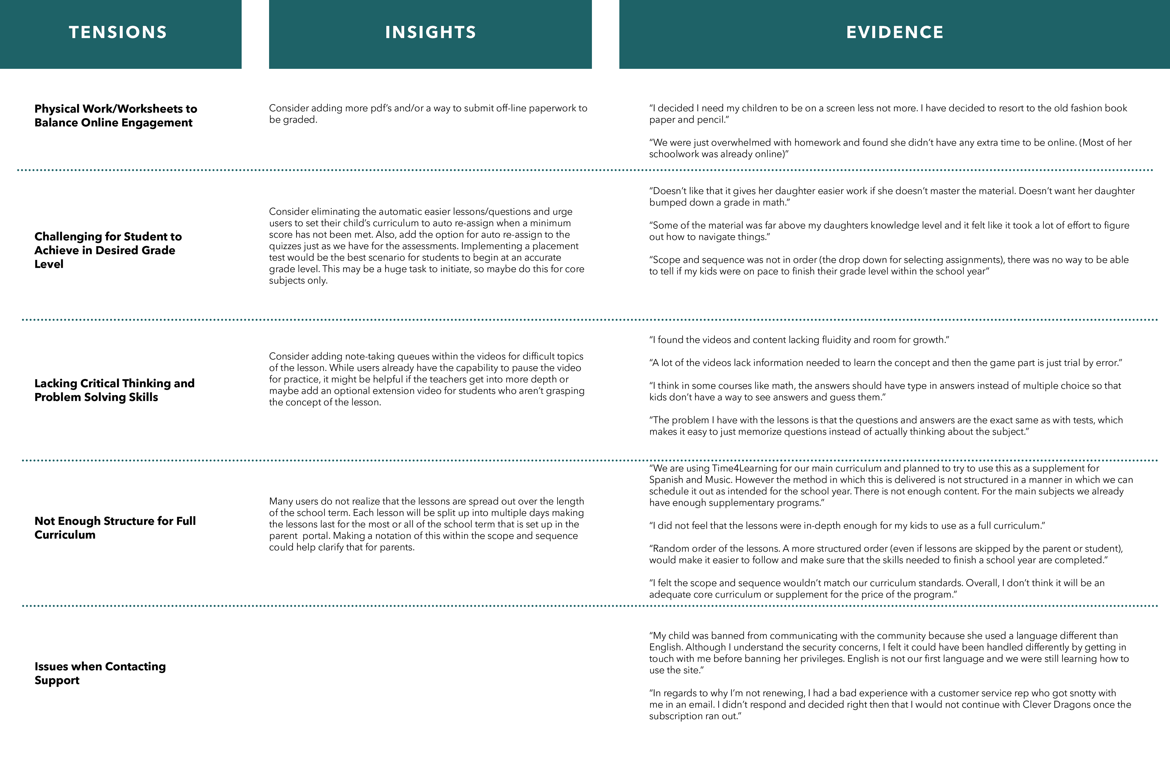
User Testing Results
- Surveys: quantitative data on initial user needs and validating new features
- Usertesting.com: A/B testing and usability testing for prototypes
- Interviews: one-on-one conversations with current users as we walked through wireframes
- Usertesting.com: A/B testing and usability testing for prototypes
- Interviews: one-on-one conversations with current users as we walked through wireframes
85% of current users surveyed reported improved clarity in curriculum building for their children, with a few reports of retention among site membership renewal
36/40 of Usertesting results for the final prototype claimed they would be interested in using the site for their homeschooling needs
32% of members returned to sign up for the trial of the new high school site
48/56 interviews expressed excitement for the growing functions and content available for students
Next Steps of Updates